Appearance
Export & Import
Export formats
The Theme Settings dialog's Export theme section lists all eleven export formats as a single-column list — each row shows the format label + a one-line description, with Preview and Download buttons on the right (test ids export-preview-btn-{id}). For every format except Systema JSON, both buttons are disabled (with a tooltip) until the theme has at least one non-meta token. Preview opens a full-screen read-only overlay (data-testid="export-preview-dialog") with syntax highlighting (highlight.js, common bundle — JSON/CSS/JS/TS/SCSS/Swift/Kotlin/XML), per-line gutter numbers, colour chips next to every recognised literal (hex, rgb[a](...), Swift/Compose Color(red:…, green:…, blue:…)), and Copy-to-clipboard. Download saves a single file or zips multi-file bundles client-side via jszip (zip base name {slug}.{formatId}.zip).
The preview header carries a search field with a live match counter and prev/next chevron buttons (Enter / Shift-Enter cycle, Escape clears). Matches are highlighted amber inline; the active one gets a thicker amber + outline. For multi-file bundles, the query persists across file switches and the file list on the left shows an amber dot next to every file that contains a hit — typing a query auto-jumps to the first matching file when the current one has no matches.
Every format reads the current preview mode (previewModeId) and emits that mode first — the plugin view and export stay aligned. Missing previewModeId falls back to the first enabled mode.
The first column is the exact UI label; the id (used in test ids and the zip base name) is in parentheses.
| Format (id) | Filename | What's inside |
|---|---|---|
Systema JSON (systema) | {name}.systema.json | Full re-importable theme config — a bare Theme object (no version envelope), with settings / color.settings normalised to carry every key. Source of truth. |
Design Tokens (W3C) (dtcg) | {name}.tokens.json (single mode) / {slug}.dtcg.zip (multi-mode: one {mode}.tokens.json per mode + index.json) | W3C DTCG format with $value / $type / $description leaves. Works with Tokens Studio, Style Dictionary 4+. Meta docs duplicated into each mode file via the default-bucket fallback so every file is self-contained. |
Style Dictionary (legacy) (style-dictionary) | {name}.style-dictionary.json (single) / {name}.{mode}.style-dictionary.json zipped | Pre-DTCG Amazon Style Dictionary structure ({ value, comment }). For older SD pipelines that haven't migrated to DTCG. |
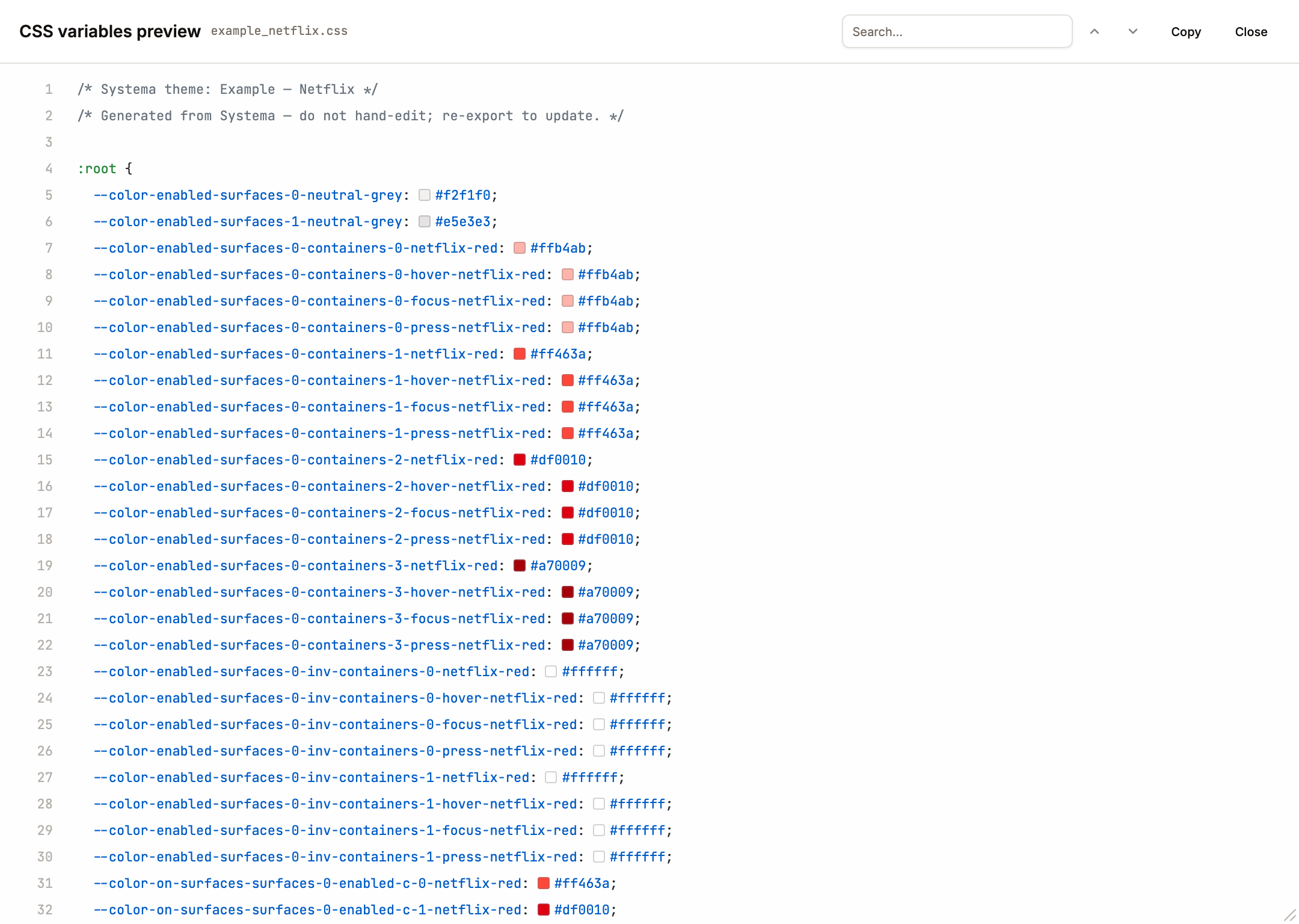
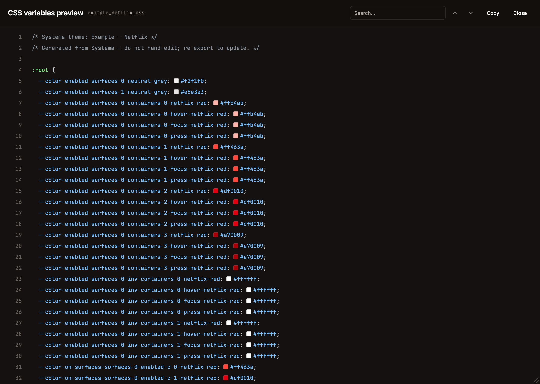
CSS variables (css) | {name}.css | :root baseline + [data-theme="<mode>"] override per additional mode + @media (prefers-color-scheme: dark) { :root:not([data-theme]) { … } } system fallback. |
Tailwind v3 config (tailwind) | {name}.tailwind.config.js | module.exports = { theme: { extend: { colors } } } with the baseline mode palette (color/ segment stripped so consumers write bg-enabled-surfaces-0-brand-faint / bg-enabled-surfaces-0-containers-0-brand-vivid). Works with Tailwind v4 too via @config "./path". |
Tailwind v4 CSS (tailwind-v4) | {name}.tailwindv4.css | Native v4 @theme { --color-*: ... } block. Import into main CSS; utilities like bg-color-enabled-surfaces-0-containers-0-brand-vivid appear automatically. [data-theme="dark"] blocks override the same variable names. |
SCSS variables (scss) | {name}.scss | $kebab-case variable per token, using the baseline mode. Additional modes emit @mixin mode-{name} { ... !global } blocks the consumer wires up scope-by-scope. |
SwiftUI (swiftui) | {name}.swift | enum Theme { static let colorEnabledSurfaces0Containers0BrandVivid = Color(red: …, green: …, blue: …, opacity: …) } with Theme{PascalMode} companions per extra mode. |
Compose (Kotlin) (compose) | {name}.kt | object Theme { val colorEnabledSurfaces0Containers0BrandVivid = Color(red = …f, green = …f, blue = …f, alpha = …f) } + Theme{PascalMode} objects. Jetpack Compose. |
Android XML (android-xml) | values/{name}_colors.xml + values-night/… (dark) + values-<slug>/… (other modes), zipped as {slug}.android-xml.zip | Gradle-convention folder hints baked into the zip paths; drop-in to app/src/main/res/. ARGB hex format. |
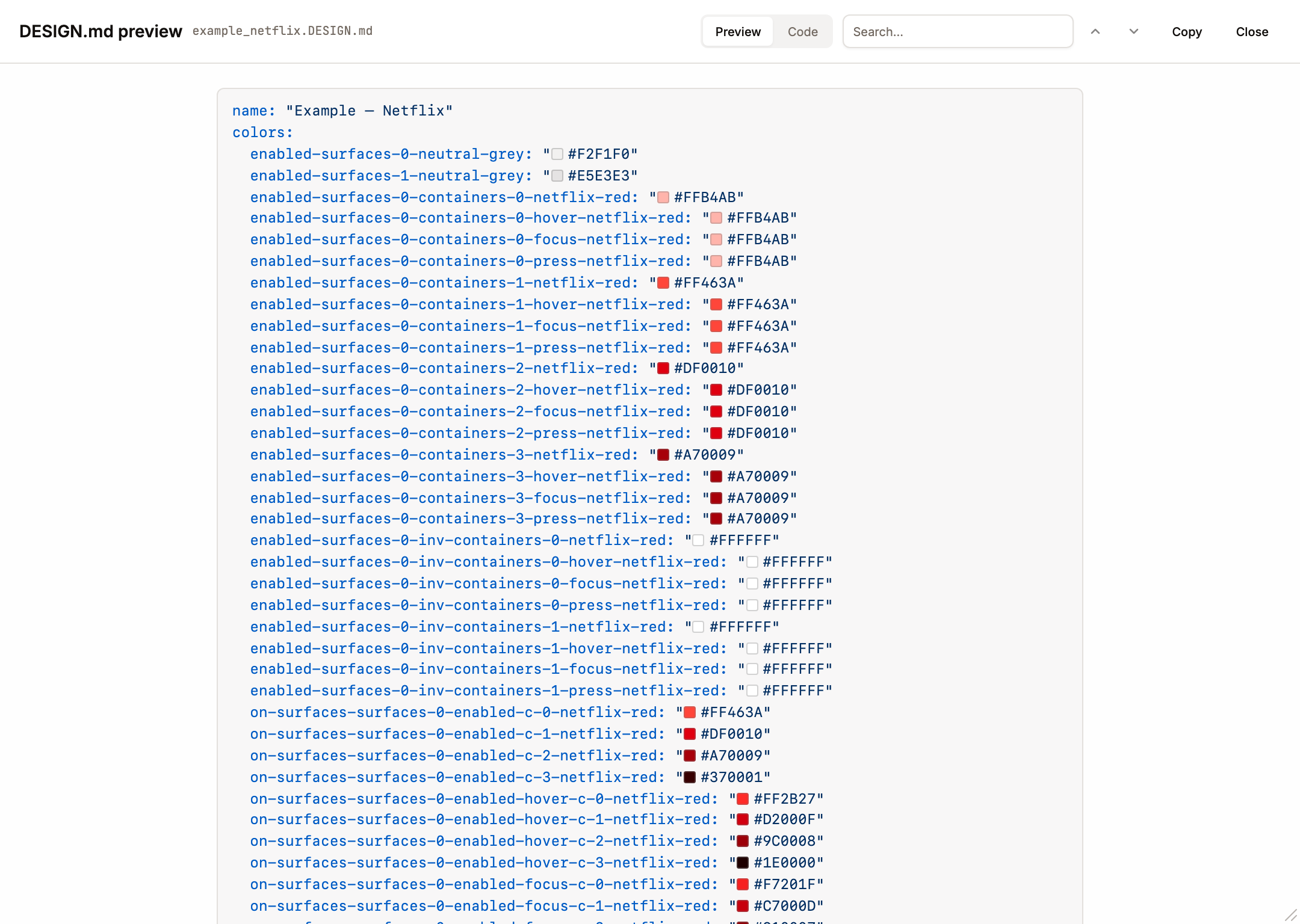
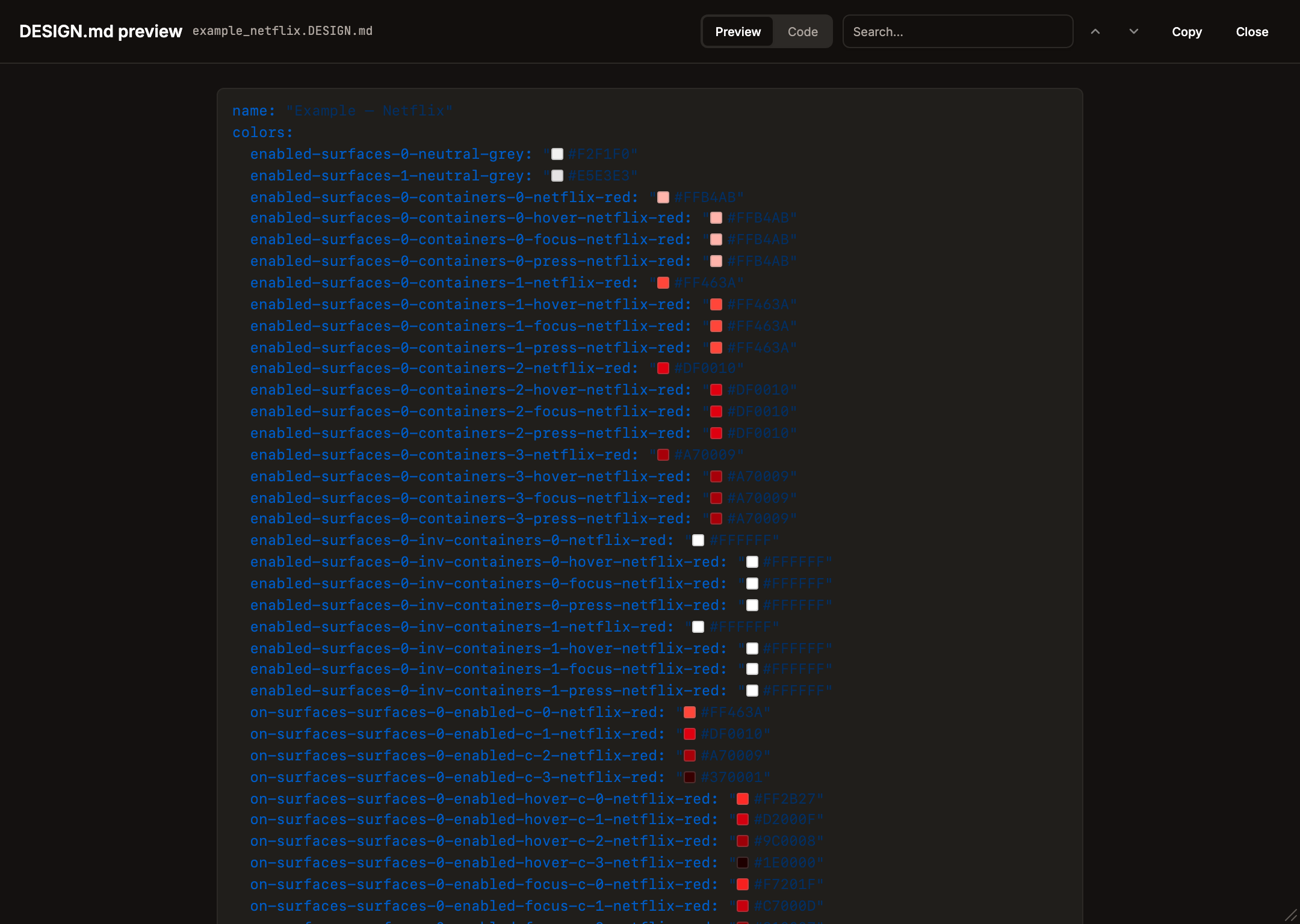
DESIGN.md (design-md) | {name}.DESIGN.md | YAML front-matter (colors: map) + markdown body (Overview with the theme description, Colors, Modes / Conditions / Interactions, Agent Prompt Guide), each item carrying its optional description. Google Stitch / VoltAgent DESIGN.md format — drop into project root so AI coding agents (Claude Code, Cursor, v0) use it as the visual-identity source of truth. |
The Systema JSON remains the round-trip shape for re-import via the Add Theme dialog. All other writers derive from generateAllTokensWithStats(theme) — single source of truth for value generation — so extending a format means reading the same token list differently. They key off tokenFullPath (collection + path), so the leading color/ segment survives into flat exporters (CSS --color-*, SCSS $color-*, Swift/Compose color…, Android color_*, DTCG nesting); only the category-namespaced exporters — Tailwind v3's colors key, Tailwind v4's --color-*, and DESIGN.md's colors: block — strip that redundant color segment. Non-colour categories (meta, future layout / type) keep their own collection prefix so they never collide with colour tokens.
Meta tokens for documentation
Every export format (except the binary zip-wrappers) carries a meta prefix of documentation variables so the target system sees the theme's shape at a glance:
theme-name, optionaldescriptioncolor/contrast-model,color/collection-structure,color/skip-duplicate-tokenscolor/palette/count,color/modes/count,color/interactions/count,color/conditions/count- Per-mode details:
color/modes/{name}/seed-color | direction | contrast-factor | chroma-factor - Per-entity structure:
color/{entityName}/contrast-ratios | level-count | pattern | contrast-step | direction | colors | user-name | parents | calculate-on | figma-scopes | interactions | conditions(fields that don't apply to an entity are omitted) seed-color— a per-mode COLOR variable in thecolor/metacollection (the only COLOR among the meta tokens; the rest are STRING / FLOAT). Under compact structure it merges into thecolorcollection.
These two meta collections (theme-level single-mode meta and per-mode color/meta) are written on push by default so a Figma reader can open any file and see what theme it holds — but the push is gated by Theme Settings → Meta → Push meta to Figma (theme.settings.pushIncludeMeta, default on); turn it off to skip both collections and shrink the variable count. In export files (CSS, DTCG, Tailwind, Swift, Compose, etc.) meta is off by default to keep outputs terse; flip Theme Settings → Meta → Export meta tokens (theme.settings.exportIncludeMeta) to include it. Tokens Studio / Style Dictionary consumers who use meta to drive codegen should turn it on before downloading.
How to use each export
Each section below is written as "you downloaded the file — now what?". The examples below use real token names from the default theme so you can copy them verbatim.
Token names are index-based and condition-first, not component-named. There is no bare brand or card token — entities are indexed (surfaces-0, containers-0, content c-0) and the colour keeps its variant (brand-vivid, brand-faint, info-muted, …). The path shape is:
- Surfaces / containers (backgrounds):
color / {condition} / surfaces-{N} / [containers-{M}] / [interaction] / {colour-variant}— e.g.color/enabled/surfaces-0/brand-faint,color/enabled/surfaces-0/containers-0/brand-vivid,color/enabled/surfaces-0/containers-0/hover/brand-vivid. - Content (text / icons "on" a parent):
color / on-{parent} / surfaces-{N} / [containers-{M}] / {condition} / [interaction] / c-{N} / {colour-variant}— e.g.color/on-surfaces/surfaces-0/enabled/c-0/brand-vivid,color/on-containers/surfaces-0/containers-0/enabled/hover/c-0/brand-vivid.
The condition segment enabled is always present. Interaction segments are the interaction names hover / focus / press. disabled and selected are conditions (not interactions) and only appear if you add them under Theme Settings → Conditions — they're not in the default theme, so they're absent from the examples below.
The leading color segment survives into the flat exporters (CSS --color-*, SCSS $color-*, Swift/Compose color…, Android color_*, DTCG nesting) and is dropped by the category-namespaced ones (Tailwind v3/v4, DESIGN.md). When you toggle Export meta tokens on, additional --meta-theme-name / --meta-color-contrast-model / --meta-color-{entity}-* variables appear alongside the palette.
Systema JSON
(.systema.json). Round-trip format — reopen in any Systema instance via Add Theme → Import (welcome screen) or Theme Settings → Import (replace current theme, keep name). This is the only format Systema itself re-imports.
Design Tokens / W3C DTCG
(.tokens.json or .dtcg.zip). Feeds W3C-compliant pipelines:
Tokens Studio (Figma plugin): Settings → JSON → Load → pick
light.tokens.json(or each mode file one-by-one as sets).Style Dictionary ≥ 4.0:
npm i -D style-dictionary@4, drop files intotokens/, then:js// config.json { "source": ["tokens/*.json"], "platforms": { "css": { "transformGroup": "css", "files": [{ "destination": "vars.css", "format": "css/variables" }] } } }npx style-dictionary build.Supernova / Specify / Zeroheight: import the zip as a token set; each mode becomes a collection.
Style Dictionary (legacy)
(.style-dictionary.json). Older SD 3.x pipelines that haven't migrated to DTCG. Same recipe as DTCG above but target Style Dictionary 3.x in package.json.
CSS variables
(.css). Drop-in custom properties. Step 1 — include the file and pick a mode:
html
<!-- index.html -->
<link rel="stylesheet" href="./theme.css" />
<html data-theme="dark"><!-- omit attribute to use prefers-color-scheme --></html>
Step 2 — name mapping. Every Systema token path becomes one CSS custom property under --color-* (slashes turn into hyphens):
text
color/enabled/surfaces-0/brand-faint                       → --color-enabled-surfaces-0-brand-faint
color/enabled/surfaces-0/containers-0/brand-vivid          → --color-enabled-surfaces-0-containers-0-brand-vivid
color/enabled/surfaces-0/containers-0/hover/brand-vivid    → --color-enabled-surfaces-0-containers-0-hover-brand-vivid
color/on-surfaces/surfaces-0/enabled/c-0/brand-vivid       → --color-on-surfaces-surfaces-0-enabled-c-0-brand-vivid
Step 3 — a card-on-surface example showing the index-based nesting. Each declaration answers "what does this thing draw against, and what content sits on top":
css
/* Page sits ON surface 0 */
body {
  background: var(--color-enabled-surfaces-0-brand-faint);
  color: var(--color-on-surfaces-surfaces-0-enabled-c-0-brand-vivid);
}

/* Card = a container on surface 0 → tokens live under surfaces-0/containers-0 */
.card {
  background: var(--color-enabled-surfaces-0-containers-0-brand-vivid);
  color: var(--color-on-containers-surfaces-0-containers-0-enabled-c-0-brand-vivid);
  border-radius: 8px;
  padding: 16px;
}

/* Container with interaction states — hover/focus/press are real segments */
.button {
  background: var(--color-enabled-surfaces-0-containers-0-brand-vivid);
  color: var(--color-on-containers-surfaces-0-containers-0-enabled-c-0-brand-vivid);
  padding: 8px 16px;
  border-radius: 6px;
}
.button:hover { background: var(--color-enabled-surfaces-0-containers-0-hover-brand-vivid); }
.button:active { background: var(--color-enabled-surfaces-0-containers-0-press-brand-vivid); }
.button:focus { background: var(--color-enabled-surfaces-0-containers-0-focus-brand-vivid); }
(A disabled or selected look would use a color/disabled/… or color/selected/… token — but those conditions aren't in the default theme; add them under Theme Settings → Conditions to generate them.)
Step 4 — flip mode at runtime from JS:
js
document.documentElement.setAttribute("data-theme", isDark ? "dark" : "light");

// Or, attach to a system-preference listener:
const mq = matchMedia("(prefers-color-scheme: dark)");
mq.addEventListener("change", (e) => {
  document.documentElement.setAttribute("data-theme", e.matches ? "dark" : "light");
});
The @media (prefers-color-scheme: dark) fallback inside the exported file kicks in automatically when data-theme isn't set.
Tailwind v3 config
(.tailwind.config.js). Step 1 — wire as a preset in your own config:
js
// tailwind.config.js
const systema = require("./my_theme.tailwind.config.js");

module.exports = {
  presets: [systema],
  content: ["./src/**/*.{html,tsx,jsx}"],
};
Step 2 — name mapping. The v3 export nests the palette under colors, so each token path becomes a hyphen-joined utility (the color segment is stripped):
text
color/enabled/surfaces-0/brand-faint                    → bg-enabled-surfaces-0-brand-faint
color/enabled/surfaces-0/containers-0/brand-vivid       → bg-enabled-surfaces-0-containers-0-brand-vivid
color/on-surfaces/surfaces-0/enabled/c-0/brand-vivid    → text-on-surfaces-surfaces-0-enabled-c-0-brand-vivid

# Interaction segments (hover / focus / press) are part of the path:
color/enabled/surfaces-0/containers-0/hover/brand-vivid → bg-enabled-surfaces-0-containers-0-hover-brand-vivid   (use as hover:bg-…)
color/enabled/surfaces-0/containers-0/focus/brand-vivid → bg-enabled-surfaces-0-containers-0-focus-brand-vivid   (use as focus:bg-…)
color/enabled/surfaces-0/containers-0/press/brand-vivid → bg-enabled-surfaces-0-containers-0-press-brand-vivid   (use as active:bg-…)
Step 3 — a card-on-surface example. The page sits on a surface, the card is a container on top with its own background + on-content, and the button rolls through hover / focus / press via Tailwind variants:
jsx
// Card.tsx
export function Card({ title, body, onContinue }) {
  return (
    // 1. Page background = surface 0
    <div className="bg-enabled-surfaces-0-brand-faint
                    text-on-surfaces-surfaces-0-enabled-c-0-brand-vivid min-h-screen p-8">

      {/* 2. Card = a container on surface 0 → surfaces-0/containers-0 */}
      <div className="bg-enabled-surfaces-0-containers-0-brand-vivid
                      text-on-containers-surfaces-0-containers-0-enabled-c-0-brand-vivid
                      rounded-lg p-4 max-w-md">

        <h2 className="text-base font-semibold mb-2">{title}</h2>
        <p className="mb-4">{body}</p>

        {/* 3. Interaction states wired through Tailwind variants —
              hover / focus / press are real path segments. */}
        <button
          type="button"
          onClick={onContinue}
          className="px-4 py-2 rounded font-medium
                     bg-enabled-surfaces-0-containers-0-brand-vivid
                     text-on-containers-surfaces-0-containers-0-enabled-c-0-brand-vivid
                     hover:bg-enabled-surfaces-0-containers-0-hover-brand-vivid
                     focus:bg-enabled-surfaces-0-containers-0-focus-brand-vivid focus:outline-none
                     active:bg-enabled-surfaces-0-containers-0-press-brand-vivid"
        >
          Continue
        </button>

      </div>
    </div>
  );
}
Step 4 — switch modes. The v3 preset emits one palette per mode under colors; the runtime selector is up to you (data-attribute, class, or CSS-variables shim). Most teams use the CSS-variables export for runtime mode switching and the Tailwind config purely as a name map. Also works in Tailwind v4 via @config "./my_theme.tailwind.config.js".
Tailwind v4 CSS
(.tailwindv4.css). Step 1 — import alongside Tailwind:
css
/* app.css */
@import "tailwindcss";
@import "./my_theme.tailwindv4.css";
Step 2 — v4 emits each token under Tailwind's --color-* namespace (the Systema color path segment is folded into that namespace), so utilities all start with bg-color- / text-color- / border-color-:
text
color/enabled/surfaces-0/brand-faint                    → bg-color-enabled-surfaces-0-brand-faint
color/enabled/surfaces-0/containers-0/brand-vivid       → bg-color-enabled-surfaces-0-containers-0-brand-vivid
color/enabled/surfaces-0/containers-0/hover/brand-vivid → bg-color-enabled-surfaces-0-containers-0-hover-brand-vivid   (hover:bg-…)
color/on-surfaces/surfaces-0/enabled/c-0/brand-vivid    → text-color-on-surfaces-surfaces-0-enabled-c-0-brand-vivid
Step 3 — same card example, just with the v4 color- prefix. Structure is identical:
jsx
// Card.tsx (Tailwind v4)
export function Card({ title, body, onContinue }) {
  return (
    <div className="bg-color-enabled-surfaces-0-brand-faint
                    text-color-on-surfaces-surfaces-0-enabled-c-0-brand-vivid min-h-screen p-8">
      <div className="bg-color-enabled-surfaces-0-containers-0-brand-vivid
                      text-color-on-containers-surfaces-0-containers-0-enabled-c-0-brand-vivid
                      rounded-lg p-4 max-w-md">
        <h2 className="text-base font-semibold mb-2">{title}</h2>
        <p className="mb-4">{body}</p>
        <button
          type="button"
          onClick={onContinue}
          className="px-4 py-2 rounded font-medium
                     bg-color-enabled-surfaces-0-containers-0-brand-vivid
                     text-color-on-containers-surfaces-0-containers-0-enabled-c-0-brand-vivid
                     hover:bg-color-enabled-surfaces-0-containers-0-hover-brand-vivid
                     focus:bg-color-enabled-surfaces-0-containers-0-focus-brand-vivid focus:outline-none
                     active:bg-color-enabled-surfaces-0-containers-0-press-brand-vivid"
        >
          Continue
        </button>
      </div>
    </div>
  );
}
Step 4 — switch modes at runtime. The exported file emits [data-theme="dark"] { --color-*: ...; } blocks, so flipping the attribute on <html> swaps every utility instantly:
ts
// useThemeMode.ts
export function setMode(mode: "light" | "dark") {
  document.documentElement.setAttribute("data-theme", mode);
}

// Usage:
setMode(prefersDark ? "dark" : "light");
SCSS variables
(.scss). Step 1 — @use (or @import on older Sass) the generated partial. Variable names are the full token path kebab-cased, so the color segment is kept: color/enabled/surfaces-0/containers-0/brand-vivid → $color-enabled-surfaces-0-containers-0-brand-vivid, color/on-surfaces/surfaces-0/enabled/c-0/brand-vivid → $color-on-surfaces-surfaces-0-enabled-c-0-brand-vivid.
scss
// main.scss
@use "./my_theme" as theme;

.button {
  background: theme.$color-enabled-surfaces-0-containers-0-brand-vivid;
  color: theme.$color-on-containers-surfaces-0-containers-0-enabled-c-0-brand-vivid;

  &:hover { background: theme.$color-enabled-surfaces-0-containers-0-hover-brand-vivid; }
}
Step 2 — for extra modes, wrap a scope in the generated mixin (one mixin per non-baseline mode):
scss
.dark-surface {
  @include theme.mode-dark;
  // everything inside resolves to dark-mode values
  background: theme.$color-enabled-surfaces-0-brand-faint;
}
SwiftUI
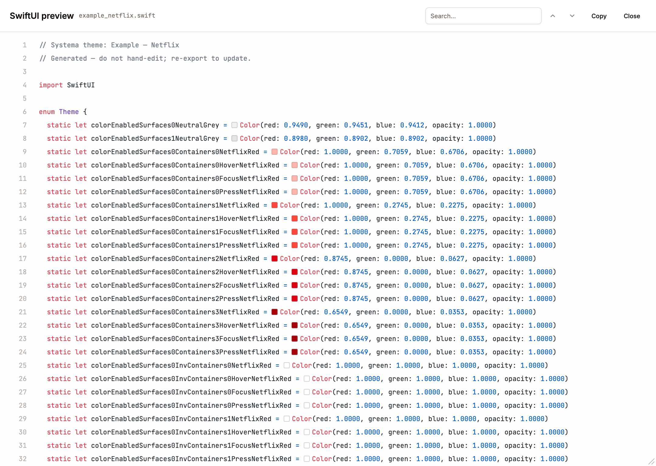
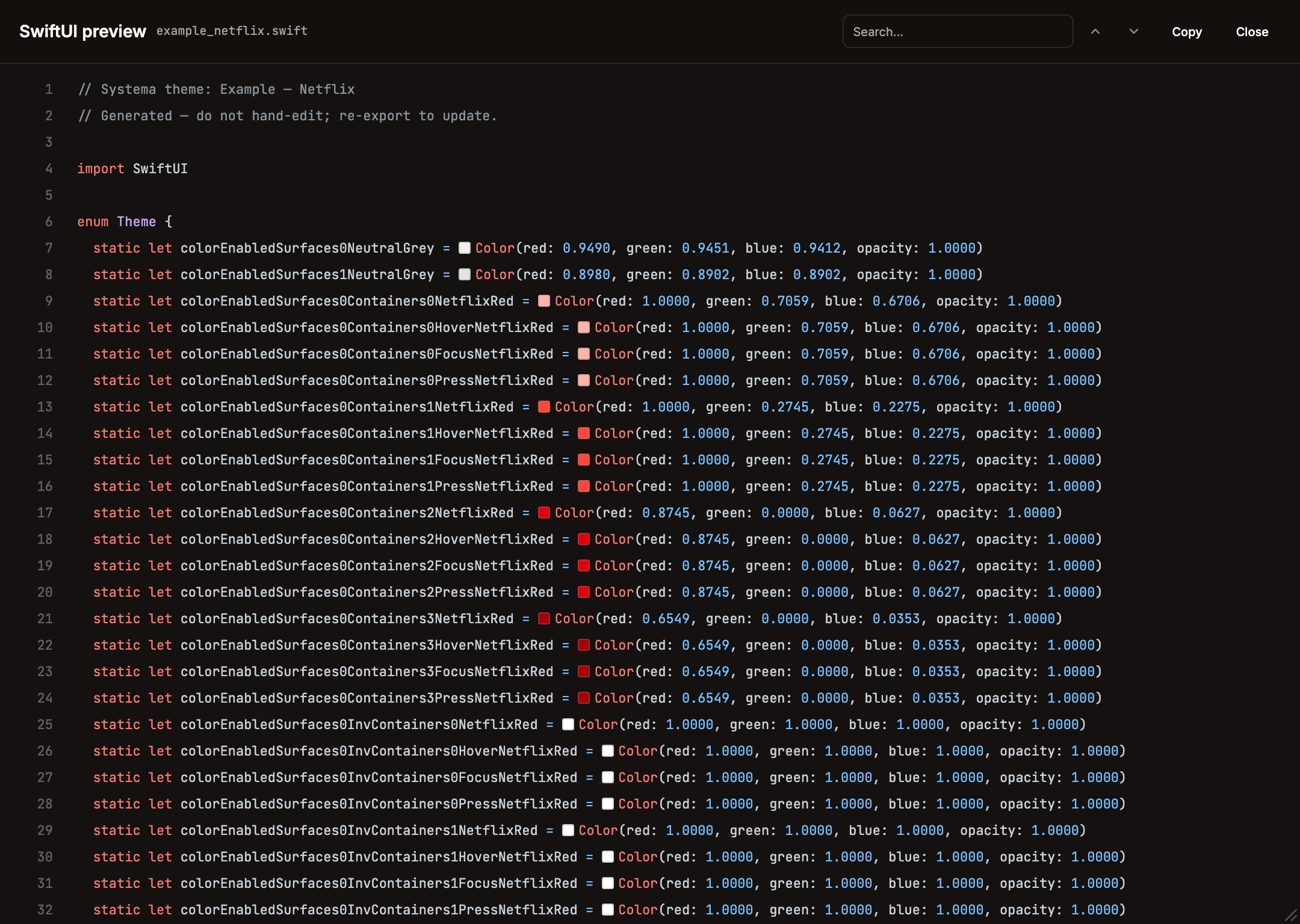
(.swift). Step 1 — drop my_theme.swift into your Xcode target. Constant names are the full token path camelCased, so the color segment is kept: color/enabled/surfaces-0/containers-0/brand-vivid → colorEnabledSurfaces0Containers0BrandVivid, color/on-containers/surfaces-0/containers-0/enabled/c-0/brand-vivid → colorOnContainersSurfaces0Containers0EnabledC0BrandVivid. Step 2 — use inside any View:
swift
// PrimaryButton.swift
import SwiftUI

struct PrimaryButton: View {
  let title: String
  let action: () -> Void
  @Environment(\.colorScheme) var colorScheme

  var body: some View {
    Button(action: action) {
      Text(title)
        .foregroundColor(colorScheme == .dark
          ? ThemeDark.colorOnContainersSurfaces0Containers0EnabledC0BrandVivid
          : Theme.colorOnContainersSurfaces0Containers0EnabledC0BrandVivid)
        .padding(.horizontal, 16)
        .padding(.vertical, 8)
        .background(colorScheme == .dark
          ? ThemeDark.colorEnabledSurfaces0Containers0BrandVivid
          : Theme.colorEnabledSurfaces0Containers0BrandVivid)
        .cornerRadius(8)
    }
  }
}
If your theme has only one mode, the Theme{Mode} companion enums aren't emitted — use Theme.colorEnabledSurfaces0Containers0BrandVivid directly.
Compose (Kotlin)
(.kt). Step 1 — drop my_theme.kt into app/src/main/java/design/systema/<themeslug>/ (the file declares package design.systema.<themeslug>). Property names follow the same camelCase rule as SwiftUI (color/enabled/surfaces-0/containers-0/brand-vivid → colorEnabledSurfaces0Containers0BrandVivid). Step 2 — pick the mode palette and pass it into Material components:
kotlin
// PrimaryButton.kt
import androidx.compose.foundation.isSystemInDarkTheme
import androidx.compose.material3.Button
import androidx.compose.material3.ButtonDefaults
import androidx.compose.material3.Text
import androidx.compose.runtime.Composable

@Composable
fun PrimaryButton(text: String, onClick: () -> Unit) {
  val palette = if (isSystemInDarkTheme()) ThemeDark else Theme
  Button(
    onClick = onClick,
    colors = ButtonDefaults.buttonColors(
      containerColor = palette.colorEnabledSurfaces0Containers0BrandVivid,
      contentColor = palette.colorOnContainersSurfaces0Containers0EnabledC0BrandVivid,
    ),
  ) {
    Text(text)
  }
}
Android XML
(.android-xml.zip). Step 1 — unzip into app/src/main/res/. You get:
text
res/
  values/        my_theme_colors.xml   ← baseline mode (applied by default)
  values-night/  my_theme_colors.xml   ← dark mode (Android auto-picks when device is in dark)
  values-hicon/  my_theme_colors.xml   ← any extra mode (e.g. "High Contrast")
Step 2 — name mapping. Each resource name is the full token path snake-cased, so the leading color segment is kept: color/enabled/surfaces-0/containers-0/brand-vivid → color_enabled_surfaces_0_containers_0_brand_vivid, color/on-containers/surfaces-0/containers-0/enabled/c-0/brand-vivid → color_on_containers_surfaces_0_containers_0_enabled_c_0_brand_vivid. (Android's own @color/ is the resource type prefix, distinct from the color_ in the name.) Reference them from XML layouts:
xml
<!-- res/layout/button.xml -->
<com.google.android.material.button.MaterialButton
    android:layout_width="wrap_content"
    android:layout_height="wrap_content"
    android:text="Save"
    android:textColor="@color/color_on_containers_surfaces_0_containers_0_enabled_c_0_brand_vivid"
    app:backgroundTint="@color/color_enabled_surfaces_0_containers_0_brand_vivid" />
Step 3 — or from Kotlin code:
kotlin
val brand = ContextCompat.getColor(context, R.color.color_enabled_surfaces_0_containers_0_brand_vivid)
binding.root.setBackgroundColor(
    ContextCompat.getColor(context, R.color.color_enabled_surfaces_0_brand_faint)
)
Android picks the right values-*/ folder automatically based on device configuration (system dark, uiMode, etc.) — no runtime switching code needed for the values-night/ case.
DESIGN.md
When you Preview a .md export, the dialog defaults to a rendered GitHub-style document view (via the chat's MarkdownDocument renderer) and offers a header segmented control to flip between Preview (rendered) and Code (raw). Search and colour chips work in both views.
(.DESIGN.md). Step 1 — rename to plain DESIGN.md and drop into your project root (the filename is the convention AI agents look for):
text
my-app/
├── DESIGN.md        ← here
├── src/
├── package.json
└── …
Step 2 — tell your AI coding agent to use it. Examples:
text
Claude Code (CLI):   read DESIGN.md and build a pricing page that matches
Cursor:              cmd-L → "use DESIGN.md for styling, build a Button component"
v0.dev / Lovable:    paste the file contents into the prompt and request components
Step 3 — the agent reads the YAML front-matter for exact hex values and the prose body for intent. Unlike the other exporters, DESIGN.md strips the leading color/ segment from its colors: keys (color/enabled/surfaces-0/containers-0/brand-vivid → key enabled-surfaces-0-containers-0-brand-vivid, color/on-surfaces/surfaces-0/enabled/c-0/brand-vivid → key on-surfaces-surfaces-0-enabled-c-0-brand-vivid); the agent then re-adds the --color- / bg- prefix for CSS / Tailwind output:
css
/* agent-generated */
.button {
  background: var(--color-enabled-surfaces-0-containers-0-brand-vivid);
  color: var(--color-on-containers-surfaces-0-containers-0-enabled-c-0-brand-vivid);
}
The prose body documents each palette colour with its per-colour description (and stops), and lists the Modes / Conditions / Interactions axes with their descriptions and factors — so the agent reads intent, not just hex. Each palette colour, mode, condition, and interaction can be individually excluded from this export via its Include in design.md toggle (inDesignMd); excluded items drop out of both the colors: block and the prose (including the Overview summary). The redundant theme-name H1 was removed — the name lives once, in the YAML name: field.
Re-export from Systema with a different preview mode selected to get a DESIGN.md for that mode (dark, high-contrast, …) — the YAML values swap to the active mode's palette. See awesome-design-md for community examples and the spec for the full format reference.
Systema JSON shape
Every exported Systema file is a bare Theme object — { id, name, settings: { exportIncludeMeta?, pushIncludeMeta? }, color: { colors, entities, interactions, conditions, modes, settings: { seedColor, seedDirection, fixedEnabled, fixedConfig, collectionStructure, figmaVariablesPublishing, contrastModel, skipDuplicateTokens, skipLowContrastTokens, aliasDuplicateTokens } } }. The export writes the theme directly (run through getThemeSettings / getColorSettings so every settings key is present). Future categories (type, size, layout) will appear as sibling fields next to color, each with their own settings subgroup. The importer expects a bare Theme but defensively unwraps a { theme } envelope if one is supplied.
Import
Three import paths:
Welcome screen Import tab -- accepts a
.jsonfile and creates a new theme. Unique ID assigned, optional fields default gracefully.Theme Settings dialog Import -- accepts a
.jsonfile and replaces all settings in the current theme while keeping the existing theme name. All tabs (Interactions, Conditions, Modes, Entities) use the same unified import UX as the Palette: radio card theme selection, per-item checkboxes for selective import, and a "Load theme file (.json)" button that adds to the list. Entities import is always "replace" (no merge option) and is labeled "Import entity settings". Entity types show readable category names (Surfaces, Containers, Content, Scrims) instead of internal types (level, frame, top-layer, overlay).Import Colors dialog -- a dedicated dialog for importing colors into an existing theme. Three tabs:
- Theme -- radio card selection from available themes to pull colors from.
- Paste -- multi-format parser that accepts: hex, rgb, hsl, hct, oklch, hsb/hsv, JSON arrays/objects, CSS/SCSS/LESS variables, Adobe Color XML (.ase files), Coolors & ColorHunt URLs.
- Image -- Canvas-based palette extraction from uploaded images.
Each parsed color gets a per-color checkbox for selective import. Names are auto-assigned from the 31k entry color-name-list database.