Appearance
Theme Editor
The left panel is a fixed-width 480px scrollable form with five content tabs (Palette, Entities, Interactions, Conditions, Modes) plus a gear-icon Settings tab, and a top bar with the theme selector, plus an optional editor footer with hotkey / info / suggestion blocks. Scroll position, tab open/closed state, the active editor tab, and the active entity sub-tab are all persisted across sessions and across panel↔float transitions. Tab-strip counter (Palette 11, Modes 2, …) uses a monospaced number with no leading · separator; the Settings tab has no counter. The Palette tab was renamed from "Colors" to avoid clashing with the top-level Color category in the global header section nav. Interactions and Conditions were split out of the older single "States" tab when the two-axis state model landed (Conditions × Interactions); see Conditions below.
Empty State / Welcome Screen
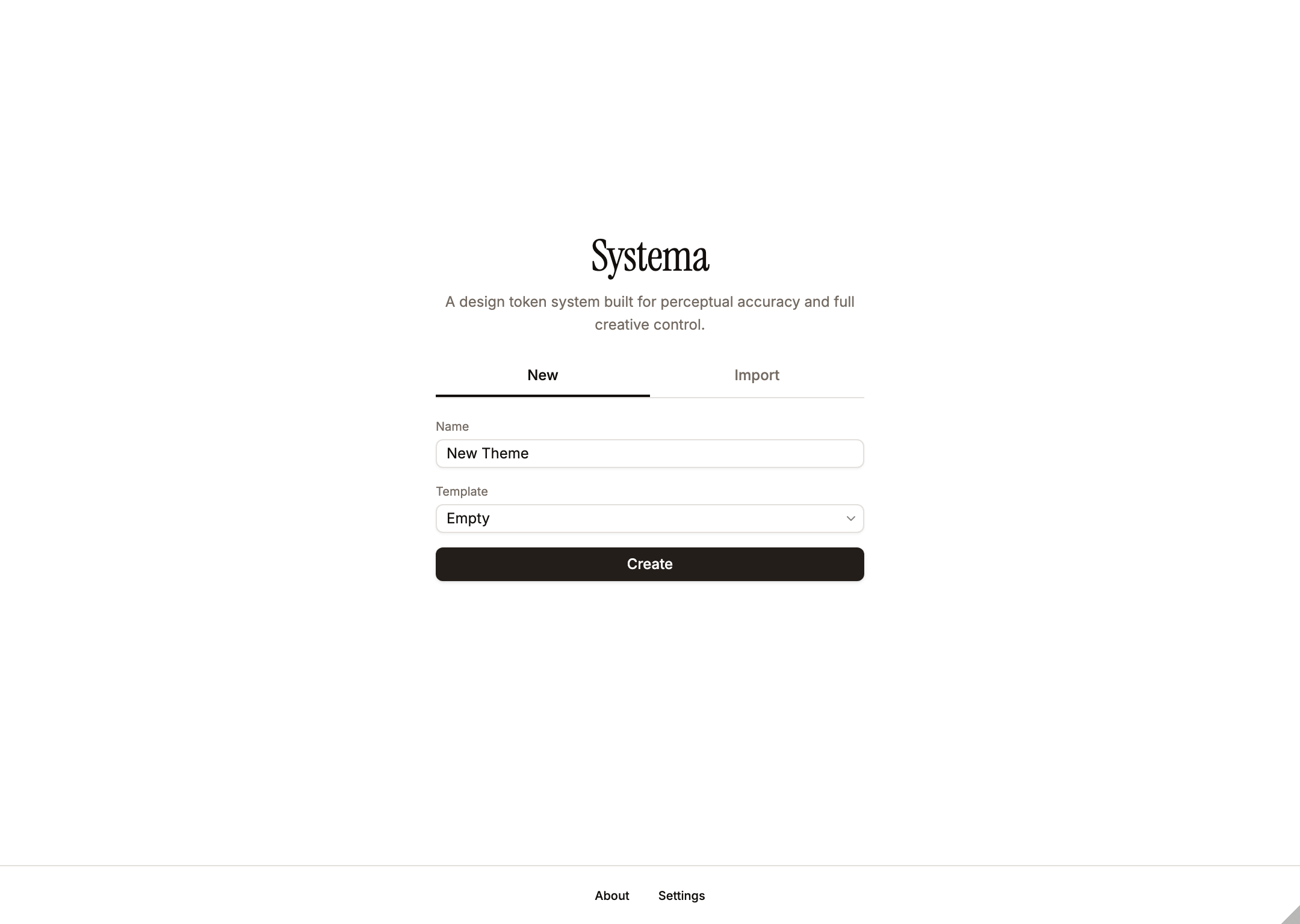
When no themes exist, a welcome screen is shown with the description: "A design token system built for perceptual accuracy and full creative control." Two tabs are available: New (creates an empty theme, or one of the built-in example templates — Example — Netflix / Slack / Reddit / Telegram) and Import (loads a theme from a .json file). Theme creation auto-saves the config and enables Push Vars immediately. AI-assisted theme creation moved into the in-plugin chat so the agent can iterate transparently on a real theme rather than emit one in a single shot — open chat after creating an empty theme and describe the system you want.
The empty template is intentionally minimal: one seeded undeletable Light mode, Surfaces single level (1:1), Containers and Content with one contrast at 3:1, Scrims single level (1:1), no colors, no interactions, only the seeded Enabled condition. This gives a clean starting point with no opinions baked in. The example templates are richer, real-world starting points: four brand-derived themes — Example — Netflix / Slack / Reddit / Telegram — each with Light + Dark modes, an accent + semantic palette whose colours carry usage descriptions (e.g. "Primary brand — CTAs"), preconfigured interactions (Hover / Focus / Press), and the seeded Enabled condition (add Disabled / Selected via Conditions Suggestions). Each example ships with collectionStructure: "compact".
Theme Selector
The plugin renders a single Global Header that spans the full width above the editor and preview panels. Layout left-to-right:
- Section nav (left) — a 4-tab segmented control for switching theme categories: Color (active), Layout, Typography, Numbers. The last three are disabled with a "Coming soon" tooltip — they reserve space for future categories that will live alongside
theme.color(see Theme Categories below). Labels use Instrument Serif (display-serifclass) to mark them as top-level domain switchers rather than chrome filters. - Theme kebab (right of section nav) — three-dot button sharing the section nav's
bg-mutedsurface so the two read as one chrome group. Opens the Theme Settings dialog (name, export/import, danger zone). The gear moved into the editor's Settings tab for color-category settings; this kebab is theme-wide. - Theme select (absolutely centered) — bold text with a chevron, hug width, borderless, hover background, letter-spacing −0.01em. Dropdown opens centered beneath (
align="center") and includes a+ New themesentinel-value item at the bottom that routes to the Add Theme dialog. Hovering a theme option live-previews the entire theme (editor body, preview panel, status bar token counts) without committing; arrow-key navigation drives the same preview. Click commits; closing without picking reverts. The row whose id matchessystema_pushedgets a Figma-logo icon to the left of the name (tooltip: "Last pushed theme — currently in this Figma file"); when the active theme is also the last-pushed one, the trigger itself shows that tooltip on hover and no extra label is drawn to avoid repeating the name. - Status pill (right) — variable-count summary with a status-dot button. Single line, 9px font:
N total · N gen · N dup · N aliased · N modes · N col. The 24×24 status-dot button collapses / expands the warnings list panel beneath the header.
Visual hierarchy: the section nav is the strongest element (top-level domain switch) in Instrument Serif; the kebab sits as its paired chrome action; the centered theme select reads as the current context; the status pill is a quiet right-aligned summary.
Theme Categories
Each theme owns a category container per token type. Today only color is implemented; the JSON shape is:
ts
interface Theme {
  id: string;
  name: string;
  description: string;
  color: {                             // implemented
    colors, entities, interactions, conditions, modes,
    settings: {                        // per-category settings subgroup
      seedColor,
      seedDirection,
      collectionStructure,
      figmaVariablesPublishing,
      contrastModel,                   // "wcag" | "apca"
    },
  };
  // typography, numbers, layout will be sibling fields here in future
  // releases — each with its own `settings` subgroup mirroring `color.settings`.
}
When future categories ship, each gets its own collection family ({theme}/typography/..., {theme}/numbers/..., {theme}/layout/...) with its own mode axis — independent from color's light/dark modes. The Color/Layout/Typography/Numbers segmented control in the global header is the entry point for editing each category. The selected theme stays the same across categories; only the editor body and preview swap.
Add Theme Dialog
Triggered from the theme selector dropdown's + New theme sentinel item. A full overlay with three tabs:
- New -- empty, or one of the example templates (Example — Netflix / Slack / Reddit / Telegram), with editable name.
- Import -- pick a
.jsonfile; the dialog shows the parsed theme name and validates before adding. - Duplicate -- pick any existing theme to clone (deep copy with a fresh ID and a name suffixed with '(copy)', editable before confirming).
AI-assisted theme creation is not a tab in this dialog. The workflow is: create an empty (or default) theme here, open the chat on that theme, and describe the design system to the agent — it will patch the theme iteratively, which keeps the generation transparent, reviewable, and within a single conversation the agent can continue.
Theme Settings Dialog
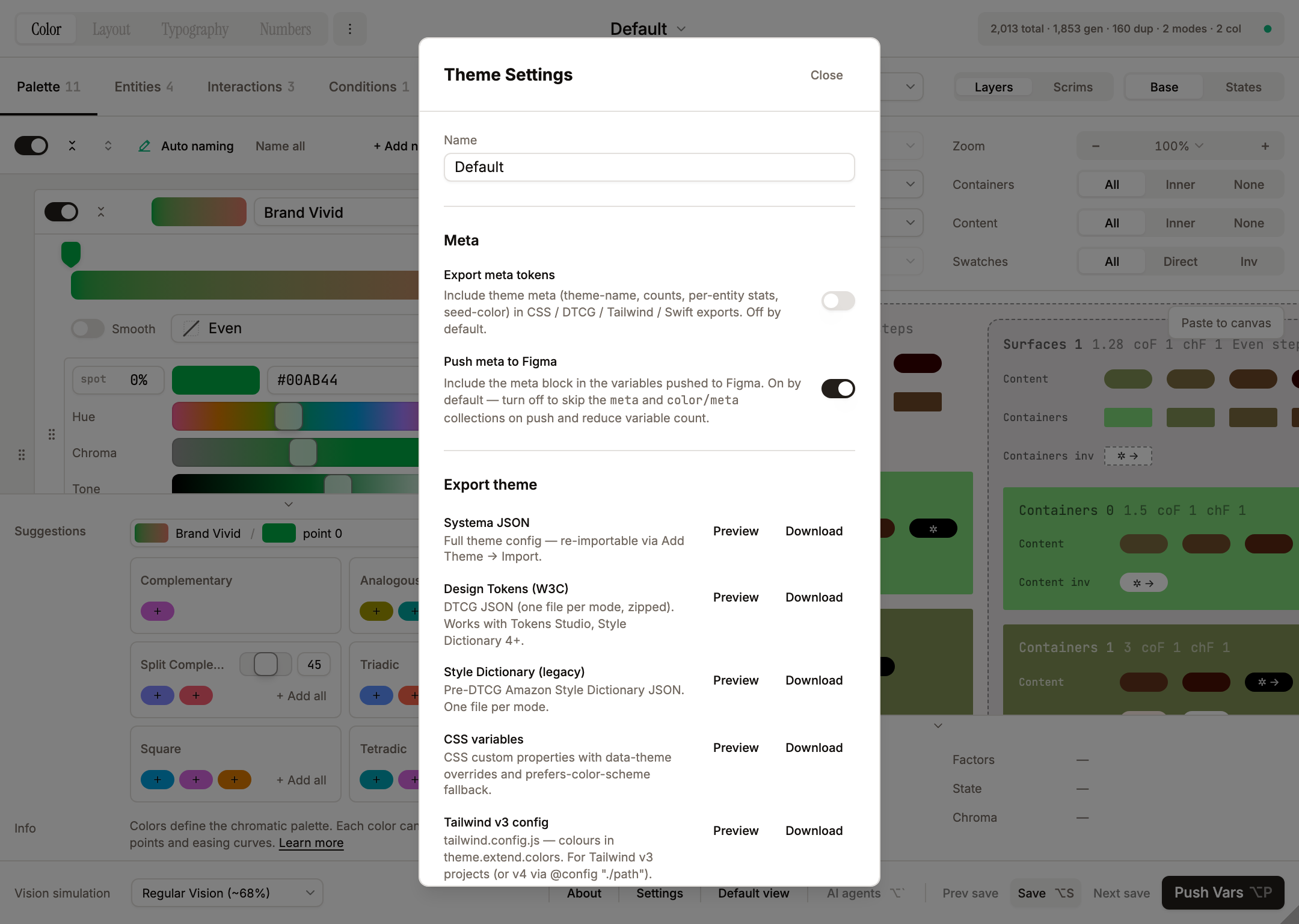
Accessed via the kebab (three-dot) button next to the theme selector. Hosts theme-wide operations only — category-specific settings live inside the editor panel (see Settings tab below). Contains:
- Name -- free-text input, used as the prefix for all generated collection paths. Duplicate names across themes are flagged with a warning.
- Description -- optional free-text description of the theme, included in JSON exports.
- Meta -- two switches stored on
theme.settingsso they travel with theme JSON exports:- Export meta tokens -- include theme meta (theme-name, counts, per-entity stats, seed-color) in CSS / DTCG / Tailwind / Swift exports. Off by default.
- Push meta to Figma -- include the meta block in the variables pushed to Figma. On by default. Off → the
metaandcolor/metacollections are skipped on push and dropped from StatusPill counts so the visible numbers match what Push Vars would emit.
- Export theme -- per-format buttons (registry in
src/lib/exporters/index.ts) that save the current theme to its native file. The 11 formats are: Systema JSON, Design Tokens (W3C) (DTCG, one file per mode, zipped), Style Dictionary (legacy), CSS variables, Tailwind v3 config, Tailwind v4 CSS, SCSS variables, SwiftUI, Compose (Kotlin), Android XML, and DESIGN.md. Multi-file results (DTCG, Style Dictionary, Android XML) download as a zip. Import lives in the editor's Import into theme flow per category, not in this dialog, so a theme's import paths scale category-by-category as layout / type / size ship. - Danger Zone -- two destructive actions:
- Clear theme -- resets
colors / interactions / conditions / modes / entities / description / settingstocreateEmptyTheme()defaults (one seeded Light mode, single-contrast entities, no colors, only the seeded Enabled condition), keeping the themeidandname. AlertDialog confirmation. - Delete theme -- permanently removes the theme. Works even when it is the last theme (returns to welcome screen).
- Clear theme -- resets
+ New theme lives inside the theme selector dropdown as the last item (below a SelectSeparator). Clicking it opens the Add Theme dialog; the Select's controlled value snaps back to the real selected theme so there's no flicker. Keeps the header minimal — no standalone button for theme creation.
Settings tab
The editor's tab strip ends with a gear-icon tab (no text label, no counter) that holds color-category settings. Future categories (layout / typography / numbers) will each get their own Settings tab so their settings stay next to the data they affect. Contains:
- Contrast model -- Segmented control (WCAG / APCA). Sets
theme.color.settings.contrastModel. APCA is currently marked "coming soon" in the UI — the flag is plumbed through settings and the preview/cheatsheet, but full APCA token generation is staged behind the WCAG math (seeColorSettings.contrastModelintypes/config.ts). Switching re-maps every stored contrast number (entitycontrastRatios,levelConfig.contrastValues,contrastStep) via the bg-aware converter insrc/lib/contrast-bridge.ts: for each value it finds the tone that satisfies it in the source model against its actual rendered background, then re-measures that tone-pair in the target model, so the visible tones stay (close to) identical across switches. The in-app disclaimer frames the mapping semantically — AA body 4.5 ↔ APCA Lc 75 · AAA 7 ↔ Lc 90 — preserving the use-case rather than pixel-identical output. See Contrast Model for the full table. - Fixed colors -- a grouped block of the Fixed-flavour controls, set off by separators rather than a border. Enable Fixed colors master switch unlocks the rest of the block. Fixed values segmented (Inherit / Custom — default Custom) chooses whether fixed entities reuse the entity's regular contrastRatios / colorIds or read dedicated
fixedContrastRatios/fixedColorIds. Fixed seed color (HctColorPicker) + Fixed seed color direction (Down / Up) configure the synthetic mode-invariant seed used to compute fixed tokens regardless of active mode. See Fixed Colors above. - Collection structure -- Segmented control (Compact / Balanced / Granular). Sets
theme.color.settings.collectionStructure. Switching this while the theme already has pushed variables triggers an AlertDialog migration confirmation. - Hide from publishing -- Switch (right-aligned via
justify-self-end). Setstheme.color.settings.figmaVariablesPublishing(inverse). When on, generated collections getcollection.hiddenFromPublishing = true. Lives insidecolor.settingsso each future category (layout / typography / numbers) will carry its own publish flag independently. - Skip duplicate tokens -- Switch (default on). Drops consecutive contrast slots whose colors collapse to identical tones (gamut clamping at the high end). Reduces variable count without changing visible output.
- Skip low-contrast tokens -- Switch (default on). Prunes tokens (direct AND inverse) whose actual contrast against parent falls below the entity's smallest contrast step in EVERY mode — see Skip low-contrast tokens above.
- Alias duplicate tokens -- Switch (default off). When on, tokens that share the same per-mode hex signature inside a collection are pushed as Figma
VARIABLE_ALIASreferences pointing at the first canonical token — extra rows show…/path/to/canonicalreferences in the Variables panel. Off keeps every token as an independentCOLORvariable (the flat mental model most teams expect). Independent ofSkip duplicate tokens— that toggle drops adjacent duplicates inside one row before aliasing runs; aliasing handles cross-row / cross-section duplicates. The alias state is part of the collection hash, so flipping the toggle triggers a full re-push instead of being skipped by the unchanged-collection fast path.
The segmented container uses the standard shadcn palette (bg-muted background, bg-background shadow-sm active chip) with a border-border outline — the outline is necessary because the Settings-tab pane itself is bg-muted and the container would otherwise disappear into the backdrop. Footer of the Settings tab routes descriptive text through the shared HotkeyInfoPanel params grid: three rows — Fixed seed color, Collection structure (the currently-selected collection-structure description, which updates live when the user changes the selection), and Contrast model (a WCAG/APCA explainer).
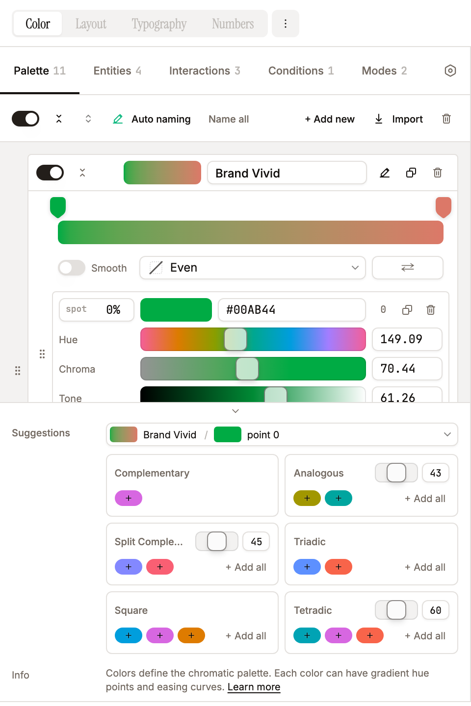
Palette
The editor's first tab — holds the theme's colour palette. Renamed from "Colors" so it doesn't clash with the top-level Color category in the header section nav. Each palette entry has a name, an enable/disable toggle, and a hex: string[] array of gradient points. New colors are created from a seed color and auto-named from a 31k entry color-name-list database. Maximum 20 colors per theme.
- Enable/Disable -- toggling off saves entity
colorIdsreferences indisabledColorRefsfor restoration. Toggling back on re-assigns previously saved refs. - Gradient points -- each color has 1-6 hex values defining a hue gradient. Points are drag-reorderable and individually editable via the HCT color picker.
- Distribution / easing curve -- per-color gradient interpolation function, chosen from the Distribution select. The picker labels are: Even (
linear, the default), Ease In (easeInSine), Ease Out (easeOutSine), Ease In-Out (easeInOutSine), Strong In (easeInCubic), Strong Out (easeOutCubic), Strong In-Out (easeInOutCubic), and Custom (custom, drag the gradient-bar markers to set per-point positions manually). The eased / strong options require 3+ points (the In-Out variants require 4+). Easing is applied to the parametertbefore CAM16-UCS interpolation between gradient points. TheEasingFunctiontype intypes/config.tsalso defines quad / quart / quint / expo / circ variants, but only the curves above are exposed in the Distribution UI. - Smooth -- optional per-color toggle (off by default) next to the Distribution selector. When on, the gradient path is taken through HCT hue/chroma via Centripetal Catmull-Rom instead of CAM16-UCS. Passes through every key stop (endpoint mirroring keeps the first/last points exactly on-curve) and unwraps hue across the 0°/360° seam. With 3+ stops this curves the trajectory; with 2 stops it still differs from the default because HCT and CAM16-UCS describe different perceptual paths between the same two endpoints. Orthogonal to easing — easing re-maps the parameter
t, Smooth changes the shape of the path itself. Persists in theme JSON ascolor.smooth. - Duplicate gradient points -- button to duplicate the last gradient point for quick expansion.
- Reverse gradient points -- button to reverse the order of all gradient points. Positions are mirrored (100-pos) rather than just reversing the array, so the spatial distribution is preserved.
- Gradient preview -- a CSS gradient strip sampled from HCT interpolation (12 stops), not sRGB, so it reflects actual perceptual blending. Tone is interpolated linearly between points (not snapped to nearest point). The easing is applied to all gradient displays including pill swatches in the editor.
- Color Suggestions panel (editor footer, Palette tab) -- harmony cards for Complementary, Analogous, Split Complementary, Triadic, Square, Tetradic with per-harmony degree sliders (Analogous / Split / Tetradic). Source picker on top supports per-gradient-point selection — a gradient colour lists each point under a muted, non-interactive header (tooltip: "Gradient — pick a specific point below"), indented with a continuous left border so the group reads as a nested list. Encoded IDs (
colorId:pointIdx) preserve the choice. Each card shows pill swatches — click one to add to the palette, + Add all adds the full harmony group. Brand colour starter palette appears when the theme has no colours. Toggled via Settings → Editor Display → "Show suggestions". - Brand colors starter palette -- a shuffleable set of 128 brand colors (from well-known companies and products) is available as a starting point. Shuffle regenerates the displayed subset.
- Auto naming -- colors are automatically named from a 31k entry color-name-list database. The toolbar provides "Name all" (rename every color in the theme) and "Auto naming" (toggle automatic naming for newly added colors) buttons.
- Swatch copy -- hovering over a color swatch in the HCT picker shows a copy icon; clicking copies the hex value. "Copied" feedback is shown for 1.5 seconds with adaptive contrast (dark icon on light colors, light on dark).
Entities
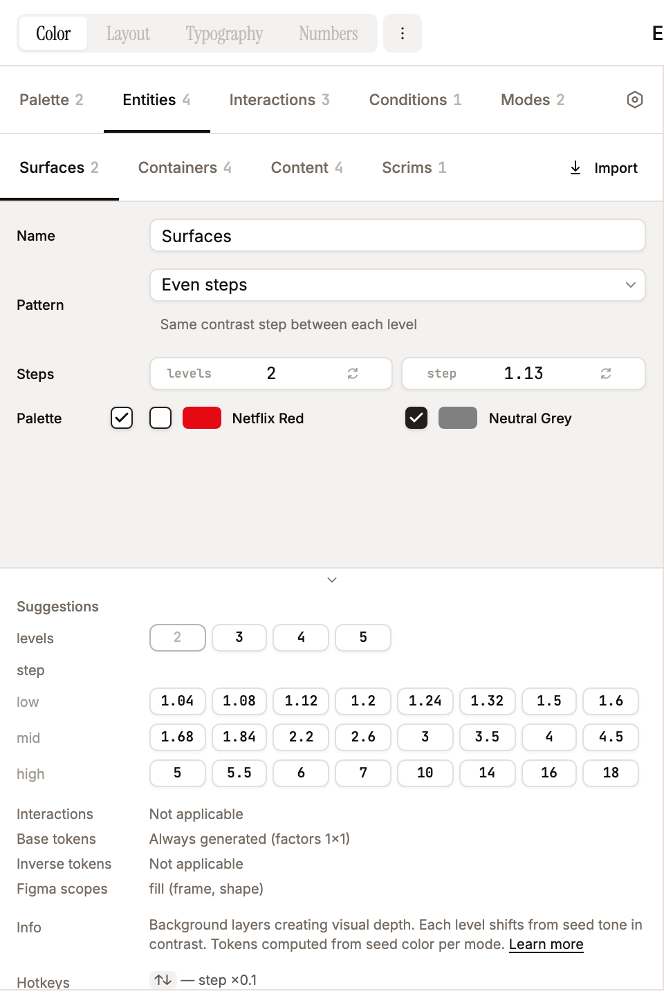
Four entity types model a nested spatial hierarchy:
| Type | UI label | Description | Token source |
|---|---|---|---|
level | Surfaces | Background levels computed from the mode seed color | levelConfig |
frame | Containers | Semantic regions on each surface level | contrastRatios (absolute from parent level tone) |
top-layer | Content | Text, icons, borders, effects on top of surfaces/containers | contrastRatios |
overlay | Scrims | Floating overlays computed from seed color | levelConfig (converted to contrast ratios) |
Entity names are fully customizable -- "Surfaces", "Containers", "Content", "Scrims" are just defaults. You can rename them to match your design system vocabulary (e.g., "Layers", "Cards", "Typography", "Overlays"). Names flow into collection paths and variable names via sanitizeName() (see Name Sanitization below).
If a user clears an entity's name field, the UI falls back to the entity-type default ("Surfaces" / "Containers" / "Content" / "Scrims") everywhere it appears: section headers in the editor, preview labels, color override picker, and generated token paths. The fallback is centralized in effectiveEntityName(entity) in src/lib/token-engine.ts. So an empty name never produces blank UI or broken paths — it just degrades gracefully to the type default.
Each entity configures:
Level config (surfaces and overlays) -- controls how levels are generated:
Pattern Name Behavior flatSingle level One contrast value from seed (default 1:1) steppedEven steps A single contrastStep; each level chains from the previousanchoredFrom seed Each level computed independently from seed at its own contrast value chainedChained Each level chains from the previous at its own contrast value alternatingAlternating Always 2 levels, each from seed Switching patterns preserves previous values in
savedPatternValuesso you can switch back without losing configuration. Max 6 levels (FIGMA_LIMITS.maxLevels).Contrast ratios / chips -- for containers and content. Each chip is a contrast ratio (e.g., 1.6, 3.1, 4.6, 7.1), minimum value 1. Add and remove chips inline. Preview updates live as you type or use arrow keys; chips re-sort only on blur/Enter so positions stay stable during editing. Level config patterns (anchored, chained) are capped at 6 chips. Ascending order is enforced at three entry points: every edit through the chips UI, WCAG↔APCA model switch (defensive re-sort after Bridge-PCA conversion), and on initial load via
migrateTheme(older saves, Figma imports, or AI-generated themes with unsorted values are normalised so thec-0…c-Nindexing stays monotonic).alternatinglevel patterns are exempt — their two values are semantically odd/even, not a ladder.Calculate on -- for
frameandtop-layerentities. Controls which surface levels to compute tokens against:All surfaces(default) -- compute on every surface levelFirst surface-- compute only on the first (lowest contrast) levelLast surface-- compute only on the last (highest contrast) level
Interactions -- explicit-list of interactions this entity emits stateful tokens for (no inherit-all sentinel). Empty list = base tokens only (no interaction sub-rows).
Conditions -- explicit-list of conditions (macro-modes) this entity opts into. Empty/undefined defaults to
[Enabled]. Toggle/checkable elements layer Selected, Expanded, Disabled, etc. on top.Color assignments -- displayed as a grid UI. Each color is a card with a checkbox + swatch + name. Clicking the swatch+name label (not just the checkbox) toggles the assignment. Uses a responsive grid layout with
repeat(auto-fill, minmax(160px, 1fr)). Checkboxes are shadcn Checkbox (h-4 w-4 / 16px with 12px check icon). Hover preview: pointing at a color row scales it subtly (hover:scale-[1.03]from left origin) and sets a sharedhoverColorOverride(owned by App, consumed by PreviewPanel) so the preview immediately shows the entity rendered with that colour — same mechanism as the preview filter's per-entity color override. Disabled colors don't trigger the preview.Parent entities -- determines what this entity is computed against:
- Surfaces:
[](from seed color) - Containers: surface entity IDs
- Content: surface and/or container entity IDs
- Overlays:
[](from seed color)
- Surfaces:
Figma scopes -- controls variable scoping: fill (frame, shape, text), stroke, effects.
Entity Suggestions panel (editor footer, Entities tab) -- per-pattern suggestion pills keyed off the active entity on the current sub-tab (Surfaces / Containers / Content / Scrims). A source picker appears when more than one entity exists on the sub-tab. Contents depend on the entity's pattern:
flat/anchored/chained/ frame / top-layer — single "add contrast" row of 24 curated values (1.04 … 18), split 8/8/8 intolow/mid/highbands. Clicking adds tocontrastValues/contrastRatios(or sets the single contrast for flat).stepped— two rows:levels(2,3,4,5) replacescount,step(24 contrast values) replacescontrastStep.alternating— two rows (level 1,level 2) that cross-disable each other so the two levels can't collapse to the same value. Already-present values are disabled with tooltips (Already in list/Current value/Same as level N — alternation would collapse/Maximum 6 contrasts reachedfor anchored/chained at cap). The current active value is highlighted with a foreground border. Toggled via the same Settings → "Show suggestions" flag as Color Suggestions.
Interaction / Condition / Mode suggestion panels (editor footer, Interactions / Conditions / Modes tabs) -- 2-column grid of clickable cards mirroring the Color Harmony card style. Whole card is the click target with a
+ Addaffordance in the top-right corner; card body shows name + factor summarycoF ×N · chF ×N(modes also show a seed-colour swatch and a direction arrow ↑/↓). No disable-when-used state — clicking the same card again adds another entry, the user manages duplicates.- Interactions: 6 presets — Hover (×1.1), Focus (×1.2), Press (×1.3), Long Press (×1.15), Drag (×1.2), and Hold (a multi-event preset combining
long-press+drag, ×1.2).releaseis deliberately omitted. - Conditions: 2 presets — Disabled (×0.8 contrast / ×0.25 chroma, static) and Selected (×1.3 contrast, static by default; flip to interactive on the row for toggle-button modeling).
- Modes: 6 presets — Light Down (#ffffff, down) and Dark Up (#000000, up) for the canonical seeds, plus themed palettes Monokai Light, Monokai Dark, Sepia, High Contrast. Hovering a Mode suggestion card live-previews the suggestion in the right-hand PreviewPanel: a phantom
Modeobject is lifted into App state (hoverModeSuggestion), PreviewPanel injects it intotheme.color.modesfor the duration of the hover and routes the phantom as the active mode.computePreviewDataderives everything from the mode's seed + direction + factors at render time, so no token regeneration is needed and the real theme stays untouched. Pointer-leave / blur clears the phantom instantly.
All three panels share the Settings → "Show suggestions" flag with the Color + Entity panels. Adding any suggestion also expands the new item's section state so it opens ready-for-tuning instead of collapsed.
- Interactions: 6 presets — Hover (×1.1), Focus (×1.2), Press (×1.3), Long Press (×1.15), Drag (×1.2), and Hold (a multi-event preset combining
Interactions
Interactions are reactions to user pointer events (hover, focus, press, …). User-created with full CRUD: create, rename, toggle, delete, drag reorder. The minimal template starts with 0 interactions. Each interaction has:
- Name -- user-defined label.
- Events -- one or more from:
hover,focus,press,long-press,drag,release. Multi-event presets (e.g. "Hold" =long-press+drag) are supported.idleanddisabledare NOT interaction events —idleis the implicit no-interaction baseline;disabledlives on the Conditions axis (see below). - contrastFactor / chromaFactor -- multipliers applied to every interaction-tagged token.
- Enabled -- disabled interactions are excluded from token generation. Disabled items show strikethrough but remain editable.
Per-entity opt-in via the entity form's Interactions checkbox row. Surfaces and overlays don't iterate interactions.
Conditions
Conditions are macro-modes of an element — mutually-exclusive personalities like Enabled / Disabled / Selected / Loading / Expanded. They compose with interactions on a separate axis.
Every theme starts seeded with the Enabled condition (id "enabled", factors 1×1, fully editable; like every condition it can be deleted, but the trash control is hidden whenever only one condition remains, so every theme always keeps at least one baseline condition). Add Disabled / Selected via the Conditions Suggestions panel. Each condition has:
- Name -- user-defined label (Enabled is editable; rename to "Active" / "Default" if you prefer).
- contrastFactor / chromaFactor -- multipliers applied to every token under this condition.
- Type --
StaticorInteractive. Static conditions emit a single token row per (contrast × color) — no interaction cross-product, no interaction segment in the path. Use for passive markers (Disabled, Loading, a non-clickable Selected indicator). Interactive conditions cross with the entity's interactions, producing one token per(condition × interaction × contrast × color). Use for toggle buttons, expandable triggers — anything where the macro-mode itself responds to pointer events. - Enabled -- disabled conditions are excluded from generation.
Per-entity opt-in via the entity form's Conditions checkbox row. The seed Enabled is always opt-in but the user can layer additional conditions on top. No automatic composability: if you need Selected + Disabled simultaneously, create a dedicated SelectedDisabled condition with the combined factors — the engine does not auto-multiply two conditions together.
Surfaces and overlays don't iterate interactions (backgrounds and scrims don't respond to pointer events), but they do iterate conditions — the condition path segment is always emitted (e.g. enabled/surfaces-0/brand), so a Selected / Disabled condition can re-tone the surface or scrim stack when the entity opts into it.
Fixed Colors (mode-invariant flavour)
A Fixed flavour can be enabled per theme (Color Settings tab → Enable Fixed colors) so frame / top-layer entities emit a second, mode-invariant token set computed from a single reference seed regardless of the active mode. This is M3-style "primary-fixed" / "primary-fixed-dim" semantics — useful for brand colors that should NOT swap with light/dark theme.
- Reference seed —
theme.color.settings.seedColor+seedDirection. Surfaces in Color Settings as "Fixed seed color" / "Fixed seed color direction". - Fixed values mode —
Inheritreuses the entity's regularcontrastRatios/colorIds(lazy default, no per-entity setup).Custom(default) reads dedicatedfixedContrastRatios/fixedColorIdsso designers can dial in a narrower mid-range ladder + reduced palette specifically for fixed brand tokens. - Per-entity editing — when Fixed is enabled in
custommode for a frame / top-layer entity, the editor's Contrasts and Palette fields gain a Mode/Fixed segmented (APCA-cheatsheet style) above their content. Switching swaps which set of values you're editing — independent for each field. - Token paths — fixed tokens land in single-mode
color/fixed/{entityName}collections (Value-only column in Figma, like themetacollection). Direct + inverse merge withinv/prefix as usual. Conditions and interactions still apply (multiplied against the synthetic fixed-mode baseline). - Preview — top toolbar adds a
Mode / Fixedsegmented when Fixed is enabled. Switching rerenders frame / top-layer entities through their fixed flavour while surfaces stay in the user-selected mode for compositional context.
Skip low-contrast tokens
Symmetric problem on both axes — tokens whose actual contrast against parent tone falls below the entity's smallest contrast step in EVERY mode get pruned from BOTH the published variable set AND the preview. Two failure modes the filter cleans up:
- Inverse axis — collapses to ~1.5:1 against an inv-container (e.g. direct content on inv container in light mode goes the "wrong way" through tone space).
- Direct axis — hits the tone-scale boundary on extreme surfaces (content on a near-black container can't go any darker than tone 0; content on a near-white surface can't go any lighter than tone 100).
Both produce unusable values that just bloat the variable set. Pruning leaves the genuinely readable pairings — M3-like single-readable-token behaviour without dropping Systema's explicit 4-quadrant direct/inverse model.
Stored at theme.color.settings.skipLowContrastTokens (default true). Toggle in the Color Settings tab. Frame / top-layer entities only — level / overlay entities don't iterate this axis.
How Factors Combine
Every token's final contrast and chroma are computed by multiplying all applicable factors:
text
effectiveContrast = baseContrast × mode.contrastFactor × condition.contrastFactor × interaction.contrastFactor
effectiveChroma   = mode.chromaFactor × condition.chromaFactor × interaction.chromaFactor
For example, a content token at base contrast 4.5:1 in Light mode (×1.05), Selected condition (×1.3, interactive), Hover interaction (×1.1):
- Effective contrast: 4.5 × 1.05 × 1.3 × 1.1 = 6.76:1
- This is the value passed to
Contrast.darkerUnsafe()to compute the target tone.
For a Static condition the interaction factor drops out entirely (one row, no interaction cross-product). The token engine downgrades Interactive→Static when the entity has zero opt-in interactions, so paths and tids stay consistent regardless of toggle position.
The preview shows both the resulting WCAG contrast (measured from actual tones) and the applied factors as coF 1.16 chF 1.0 (space-separated, no dashes) next to each swatch.
Modes
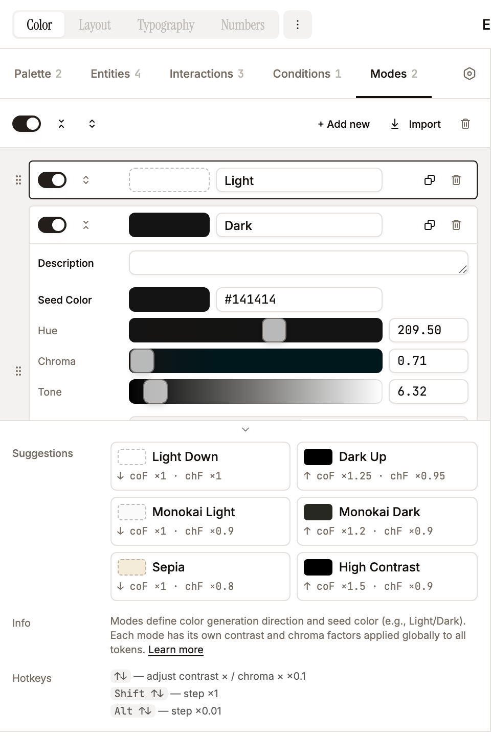
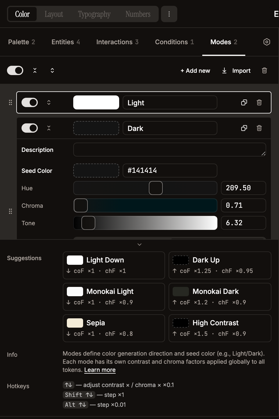
Every theme is seeded with one undeletable Light mode (mirrors the seeded Enabled condition pattern). The seed mode is fully editable (rename, retune, change direction / seed colour, enable/disable) — only the trash button is hidden so every theme keeps at least one mode row. The default config ships with two modes (Light/Dark); add Dark / High Contrast / Monokai / Sepia via the Modes tab + Suggestions panel:
| Mode | Direction | Seed color | contrastFactor | chromaFactor |
|---|---|---|---|---|
| Light Down | down | #ffffff | 1 | 1 |
| Dark Up | up | #000000 | 1.25 | 0.95 |
- Direction --
upmeans tones increase (lighter);downmeans tones decrease (darker). This is the default direction for all entities in the mode. - Seed color -- the starting tone for all level computations.
- Contrast/Chroma factors -- global multipliers applied to every token in that mode.
- Enable/Disable -- disabled modes are excluded from token generation and Figma variable modes.
- Appearance -- per-mode action block (separated by a divider) to pin this mode onto selection / current page / all pages in Figma. The scope picker shows a status suffix per option —
(set),(partial set),(unset), or(needs push)— reflecting whether the mode is already explicit on the theme's variable collections for that scope. Set is disabled when the scope is alreadyset; Unset when alreadyunset. Unset is per-mode: clicking it onLightonly clears collections whereLightis the current pin —Dark's pin on the same scope is left intact. If the theme's variable collections haven't been pushed yet, both buttons are disabled with a tooltip explaining that variables need to be pushed first; the(needs push)badge shows specifically when a mode was renamed in the editor and the Figma collection still has the old name. Empty selection underscope=selectionpre-disables both withSelect at least one node…. Status refreshes automatically after every Set/Unset round-trip, after a successful Push Vars, and on selection / current-page changes (the plugin pollsfigma.currentPage.selection+figma.currentPage.idonce per second instead of subscribing tofigma.on()events).