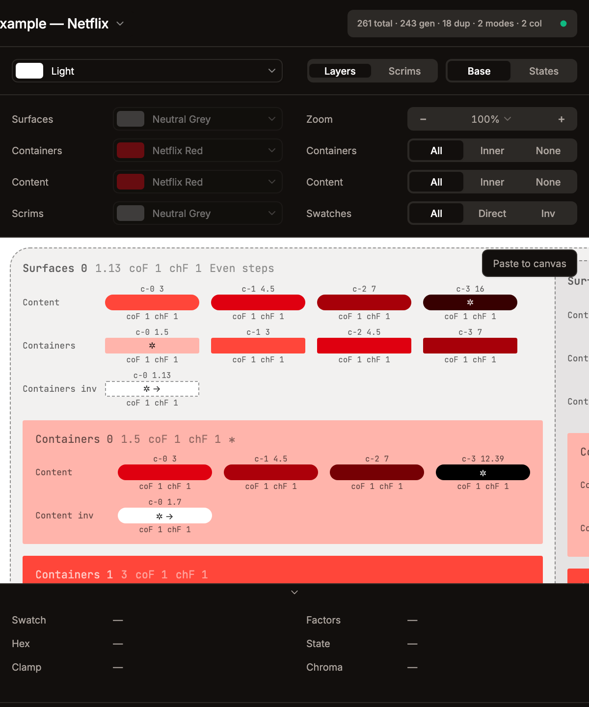
Appearance
Preview
The preview panel renders a live visualization of all generated swatches for the selected theme.
Top Toolbar
The toolbar is split into two halves with a transparent 1-px divider in the middle:
Left half (mode controls):
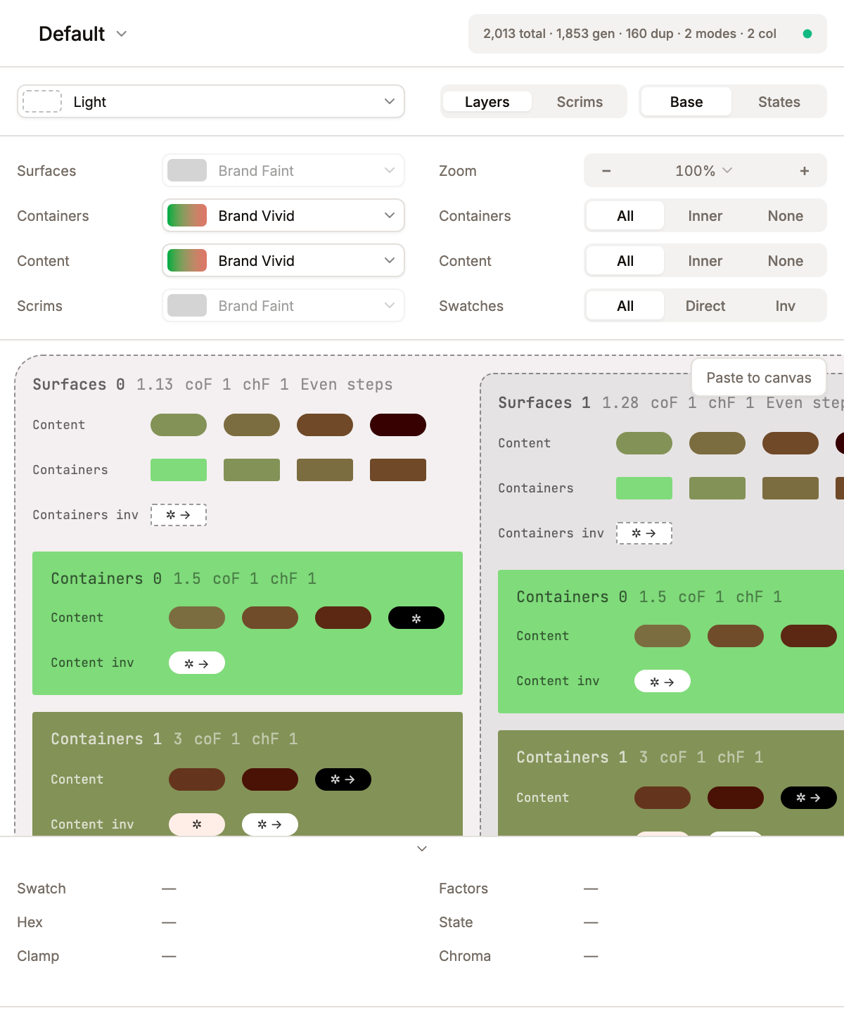
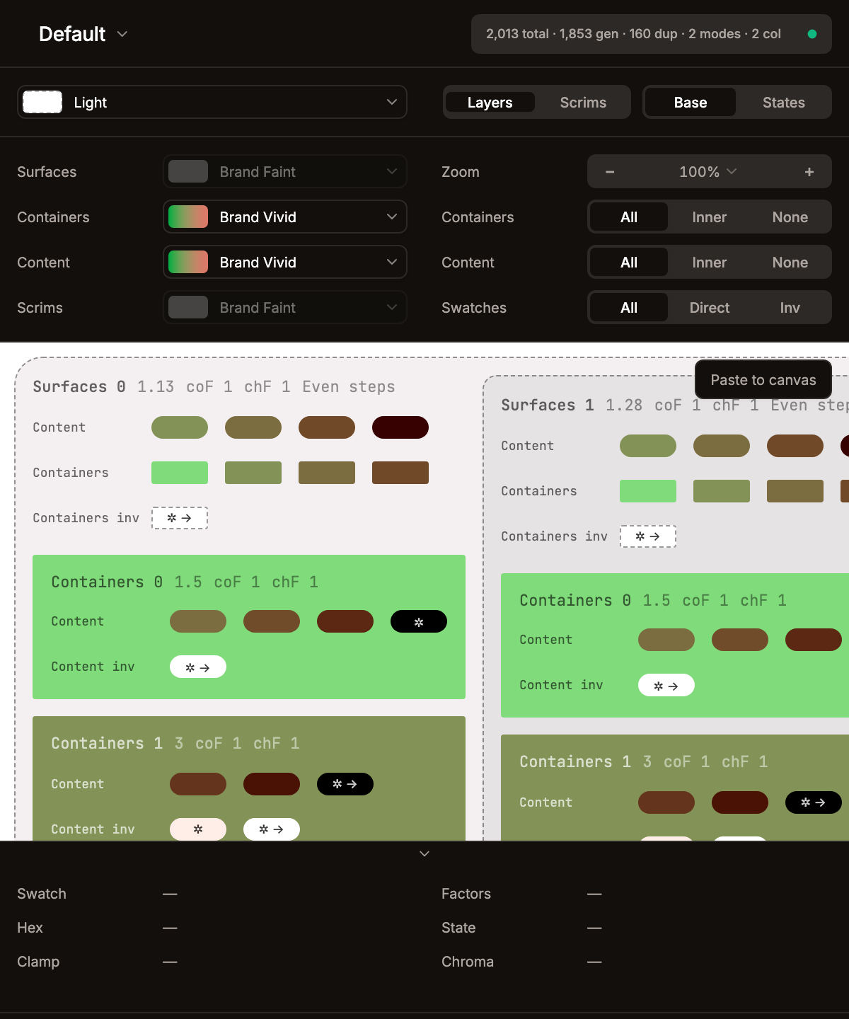
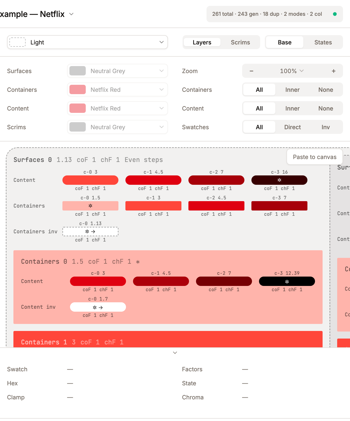
- Mode selector -- dropdown showing the active mode swatch + name. Hovering an option live-previews that mode (swatches, seed background, and computed tones) without committing; arrow-key navigation drives the same preview. The Mode select is a single full-width flex control with no label column; the 35fr/65fr grid is only used by the filter bar and footer.
- Mode / Fixed toggle -- appears only when the theme has Fixed colors enabled. Segmented control with options
Mode(render mode-aware tokens for the selected mode) andFixed(render the Fixed flavour for frame / top-layer entities, computed from the Fixed seed).
Right half (view controls), both segmented controls (bg-muted container, bg-background + shadow-sm active pill — same visual as the global header section nav and the bottom bar):
- Layers / Scrims toggle -- option labels are
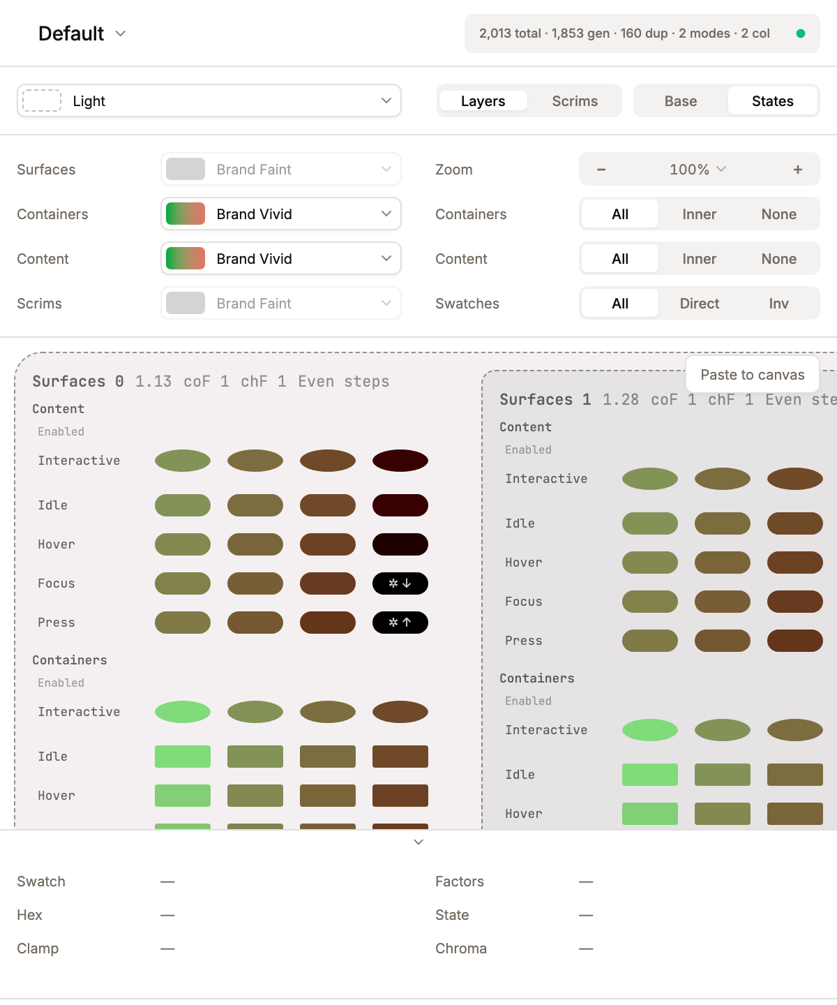
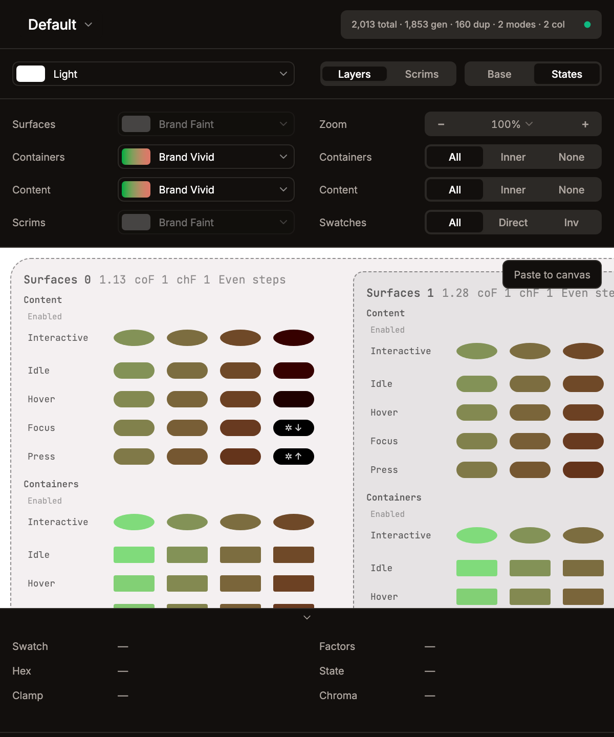
Layers(tooltip "Preview Element Layers": surfaces, containers, content) andScrims(tooltip "Preview Overlay Scrims": scrims with containers and content from the last surface). Internally these map topreviewModeelements/overlays. - Base / States toggle -- controls state expansion:
Base-- single base row per entity (no condition / interaction factors).States-- one row per condition the entity opts into, with interaction rows under each interactive condition. Switching toStateswhen the theme has no interactions or user conditions snaps back toBasewith a notification.
- Paste to canvas -- a floating button in the preview area. Captures the preview DOM as SVG (background rects + text nodes via TreeWalker, with Range.getClientRects() for precise text positioning) and sends it to the Figma plugin sandbox which renders it via
figma.createNodeFromSvg(). Zoom is temporarily reset to 100% for accurate measurements. If a Vision/CVD filter is active, colors are baked into the SVG viasimulateSvg()(Figma'screateNodeFromSvgdoesn't supportfeColorMatrix). Clamp arrows are rendered with a computed contrast color (luminance-based) instead of mix-blend-mode. Works with both narrow and wide layouts. Text nodes are stripped from the SVG before paste and recreated by the plugin as realTEXTnodes —font-familyis honoured (Inter for symbols✲ → ↑ ↓ ←and labels, JetBrains Mono for monospace chips),text-anchor="middle"keeps glyphs metric-agnostic, andlineHeightis pinned to fontSize so the recreated text sits at the same optical centre as the in-panel rendering.
Zoom controls live in the first row of the preview's display-filter column (left column of the Filter Bar below, labelled
Zoom): a−button, a Select with presets, and a+button. Zoom range is 25%–300% with aFitoption (toggle⌥⇧0) that auto-scales content to the visible area on every resize. The−/+buttons step ±5% (⌥ + −/⌥ + +). Cursor-anchored zoom-by-wheel works with⌃/⌘/⌥modifiers — the point under the cursor stays put as you scroll. The whole filter bar can be hidden via Settings → Editor Display → Preview filters (previewFiltersVisible).
Preview verbosity
A three-level setting (Settings → Editor Display → Preview verbosity, a Terse / Balanced / Verbose segmented control) controls how much textual scaffolding wraps the swatches:
- Verbose -- historical look.
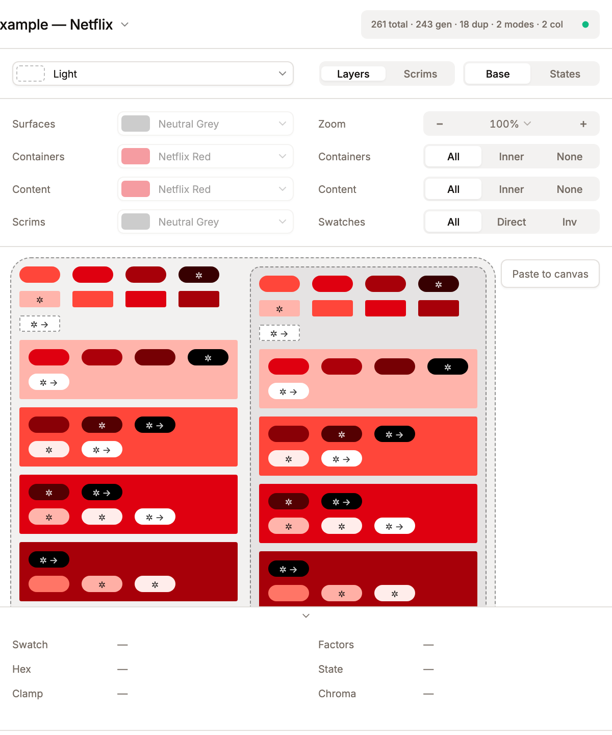
c-N N.NNandcoF X chF Ylabels above and below every swatch; 96-px wide swatch pills. - Balanced (default) -- per-swatch labels dropped, swatches collapse to 40 × 16 px. Section / row / condition headers still render so the user can orient.
- Terse -- every text label hidden (section headers, entity names, condition names, row labels, per-swatch labels). Only colour shapes + structural padding remain. Useful when pasting a clean preview to the Figma canvas without metadata noise.
Paste-to-canvas honours the active mode — the SVG export walks the live DOM, so labels that aren't rendered in panel never leave the export. When all swatches in a row are filtered out by Skip Duplicate Tokens / Skip Low-Contrast Tokens, balanced and verbose surface a one-line reason explaining which filter hid the row; terse drops the row entirely.
Conditions in the wide layout
When the preview is set to wide, EntityRowView flows its per-condition groups (Enabled, Selected, Disabled, …) horizontally — Enabled | Selected | Disabled side-by-side — instead of stacking them vertically. Same content as narrow, just laid out for wider viewports so users can compare conditions at a glance.
Filter Bar
A two-column block, each column a 35fr 65fr grid (label / control) capped at 410 px:
- Left column — Entity color overrides: per-entity selector that lets you swap which color is previewed for each entity, independent of the full set assigned in the editor. The select shows a swatch pill plus name; hovering an option live-previews that color override without committing; arrow-key navigation drives the preview. When no entities have colors, the column shows "Add colors to entities to configure the preview palette."
- Right column — Display filters: a Zoom control plus 3 horizontal segmented controls (each labelled left, control right):
- Zoom --
−button, preset Select (25 / 50 / 75 / 100 / 150 / 200 / 300% andFit),+button. See the note under Top Toolbar. - Containers --
All/Inner/None. Determines whether all container levels, only the innermost, or none are shown. (Scrims view:Show/Hide.) - Content --
All/Inner/None. Same logic for content entities. (Scrims view:Show/Hide.) - Swatches --
All/Direct/Inv. Controls whether normal-direction, inverted-direction, or both swatch sets are displayed.
- Zoom --
The Vision simulation (CVD) filter lives in the status bar at the bottom of the plugin window, not in the preview filter bar — see Vision Filter below. Moved out of the preview's right-hand column so the filter bar stays focused on what's currently being computed (entities, layers, swatch direction) and the global colour-vision lens reads as a viewing-mode toggle rather than another filter on top of the data.
Vision Filter (CVD Simulation)
Lives in src/lib/vision-filters.ts. Five color-vision-deficiency simulation modes are exposed via the Vision simulation select in the bottom status bar. The select item labels carry the population percentage inline (the label column below):
| Select label | Description |
|---|---|
| Regular Vision (~68%) | Normal trichromatic vision — all three cone types working as expected. |
| Protanopia (~1.5%) | Red-blind. L-cones absent. Reds appear dark; red, orange and green become hard to distinguish. |
| Deuteranopia (~1.2%) | Green-blind. M-cones absent. Greens shift to beige; reds shift to dark yellow. Red/green confusion. |
| Tritanopia (~0.03%) | Blue-blind. S-cones absent. Blue/green merge; yellow/pink merge. Very rare. |
| Achromatopsia (<0.01%) | No color perception — grayscale only. Useful to verify contrast holds without color. |
Each mode is a 3×3 RGB color matrix (Brettel/Vienot/Mollon coefficients). The live preview applies them via SVG <defs><filter><feColorMatrix> referenced through CSS filter: url(#vision-{mode}) on the preview wrapper — GPU-accelerated, no per-frame JS. For paste-to-canvas, simulateSvg(svg, mode) walks every fill="..." and stroke="..." attribute and bakes the matrix transformation in JS, since Figma's createNodeFromSvg() doesn't honor feColorMatrix.
Layers Preview
Nested visual structure:
- Surface levels -- background rectangles at computed tones, nested inside each other.
- Containers (frames) -- colored blocks within each surface level, each at a contrast ratio from the parent surface.
- Inv-containers -- same containers but computed in the flipped direction (e.g., lighter chips in dark mode, darker chips in light mode).
- Content (top-layers) -- swatch rows rendered on top of surfaces, containers, and inv-containers.
- Inv-content -- content swatches in the flipped direction.
Overlays Preview
- Scrim levels -- overlay background blocks computed from the seed color.
- Each overlay level contains containers and content rows derived from the last surface level.
Swatch Display
Each swatch renders as a colored rectangle 16 px tall. Its width follows the active verbosity: 40 px in balanced (default) and terse, 96 px in verbose (so the per-swatch labels have room). With:
- Border-radius -- container-type swatches use
2 px; other swatches default to a pill (height / 2). - Contrast ratio label -- in verbose mode only, a
c-N {ratio}label renders above each swatch. The ratio is the actual WCAG contrast computed via MCUContrast.ratioOfTones(or APCA Lc when the theme's contrast model is APCA). Balanced and terse drop the label; the value is still available in the hover footer. - Effective factors --
coF(effective contrast factor) andchF(effective chroma factor) render below the swatch in verbose mode only, in the formatcoF 1.39 chF 1.1(space-separated, no dashes). - Pattern label -- for surface levels, shows the level pattern name and index. Uses CSS
marginLeftinstead of template literal spaces for proper SVG export spacing. - Interactive swatches -- rendered when the entity's interaction set includes at least one pointer-style event (hover, focus, press, long-press, or drag). Respond to mouse events: hover shows the Hovered state color, click shows Pressed, Tab/focus shows Focused (outline, not color change), drag moves the swatch XY +/-16px to preview the Dragged state. This lets you test state transitions live without leaving the preview.
- Adaptive dashed borders -- swatches with low contrast against the preview background get dashed outline borders (consistent
rgba(0,0,0,0.25)everywhere: editor swatches, preview selects, SVG markers, color picker). - Empty states -- when an entity has no colors assigned, the preview shows a placeholder message instead of empty space.
- Hover preview in settings -- easing select dropdowns show a live gradient preview on hover; color filter dropdowns show a live swatch preview on hover.
- Clamp arrows -- directional arrow indicators appear inside swatches when an adjacent swatch resolves to the same color (tone clamped to 0 or 100):
↑(same as the swatch above),↓(below),←(left),→(right). When two neighbours match, the arrows combine into a single string (e.g.←→for both horizontal neighbours,↑↓for both vertical). This tells the designer that increasing contrast further won't produce a different color. Rendered with computed contrast color (luminance-based) instead of mix-blend-mode for accurate SVG export.
Drag-to-scroll (pan)
Left-button (primary) drag on the preview scroll area pans the viewport (via @use-gesture/react). Interactive elements (buttons, inputs, InteractiveSwatch rows) are excluded so their own drag semantics are preserved. A 4px threshold (filterTaps) prevents accidental pans on single clicks. The cursor changes to grabbing during a pan.
Render pipeline & caching
The preview is plain DOM — no canvas, no SVG-as-renderer — so React reconciliation is the only redraw mechanism. Because the tree is deep (levels × frames × entities × states × swatches), two complementary layers keep every drag tick out of a full rebuild:
1. Wrapper-level structural caches. computePreviewData builds the preview tree once per theme-structure change; cached wrapper objects (PreviewStateRow[], PreviewEntityRow) stay ref-stable across colour drags so React.memo on EntityRowView / NestedLevels / OverlayPreview short-circuits the whole wrapper subtree. Keys live in src/components/PreviewPanel.tsx.
| Cache | Key | Size | What it preserves |
|---|---|---|---|
makeSwatchesCache / makeSwatchesInvCache | hex points + parent tone + contrast ratios + effective factors + direction + easing + positions + contrast model | 4000 entries | The PreviewSwatch[] array for a single entity/parentTone/factor tuple. Full-data — populated with color/tone/ratio at each compute pass and published to the swatch store. |
interactionRowsCache / interactionRowsInvCache and conditionGroupsCache / conditionGroupsInvCache | entityStructSig (name + shape + states list + contrast slot count + surfaceScope + direction + entityType) + parent tone + shared (mode + states + model) signature | 2000 entries each | PreviewInteractionRow[] / PreviewConditionGroup[] arrays with stable swatch paths baked in. Colour-only edits do NOT invalidate — that's what lets InteractiveSwatchRow stay memoised during a drag. |
entityRowCache / entityRowInvCache | row kind (direct / inv / container / containerInv) + entityStructSig + parent tone + shared signature | 2000 entries | PreviewEntityRow with swatches carrying path strings. Same colour-independence invariant as the state-rows cache — wrappers above the leaves only re-render for STRUCTURAL edits (name, shape, states list, contrast slot count, surfaceScope, direction, entityType). |
Because the cache keys are structural, computePreviewData calls publishEntitySwatches(kind, entity, parentTone) BEFORE each lookup. That iterates the entity's states, calls makeSwatches(Inv) (cheap via its own LRU), and publishes every swatch to src/lib/preview-swatch-store.ts under a deterministic path — so the store always has the tick's current-colour data even when the wrapper cache keeps returning the exact same row/group objects. A module-level lastPublishedArr map short-circuits this loop when makeSwatches returns the identical cached array (unchanged-colour entities bail before doing any per-swatch work), and a per-compute publishedInThisCompute Set dedupes across repeat lookups of the same (kind, entity, parentTone) tuple from different frame/level code paths.
2. Leaf-level subscription. Terminal <SwatchAt> components (and the <InteractiveSwatchAt> variant for interactive cells that bundle 3–5 state colours into one subscribed cell) consume the swatch store via useSyncExternalStore, keyed on the stable path from the cached row. When publishSwatch(path, …) notices the data actually moved (field-level equality check), only the subscribers of that path re-render — the wrapper rows above them stay out of the React commit.
This split is what drives the benchmark numbers below:
| Bench counter | Before decomp | After decomp |
|---|---|---|
EntityRowView body runs per 3 s drag | ~5990 | 0 (structural cache hit 100%) |
NestedLevels body runs | ~100 | 1 |
entityRow / ctxGroups cache hit rate | 80% | 100% |
SwatchAt body runs | — | ~27000 (one per visible swatch whose colour actually changed × the drag ticks that moved it) |
The SwatchAt count looks large, but it's the LEGITIMATELY necessary work — every swatch bound to the dragged colour has to paint new pixels. Wrappers just stopped doing their part of the walk for zero DOM benefit.
computePreviewData itself is wrapped in useMemo and fed through useDeferredValue on the two heavy inputs (effectiveTheme, effectiveColorOverrides). React 18 can interrupt the resulting concurrent render when a more urgent update (slider tick, pointer move) arrives, so drag ticks don't block the main thread even when a cold cache forces a full recompute.
The dev-only perf harness (src/lib/preview-perf.ts) records hit/miss counters per cache, the wall-clock cost of each computePreviewData call, and a renders[component] counter fed by bumpRender(name) calls sprinkled in the hot-path components. window.__previewPerf.snapshot().renders returns the map after any interaction.
Preview Info Footer
A collapsible panel below the preview scroll area showing live details about the swatch, surface, or container under the cursor. It is split into two 50/50 halves, each a 35fr 65fr label/value grid:
Left half:
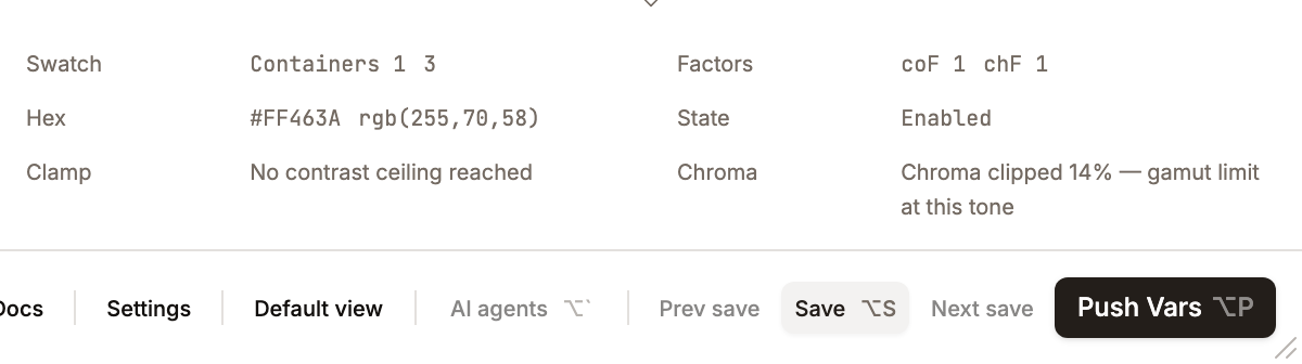
- Swatch row — entity name + column index + contrast ratio (e.g.
Containers 3 4.52); level / frame / overlay wrappers showc-N {ratio}. - Hex row — uppercase
#RRGGBBplus thergb(r,g,b)form. - Clamp row — "Same hex as neighbour — contrast ceiling reached" or "No contrast ceiling reached".
Right half:
- Factors row — effective
coF(contrast) andchF(chroma) for the hovered cell. - State row — condition name (Enabled / Selected / …) plus interaction name (Hover / Press / Idle / …). Composite interactive cells update this live as the pointer event changes.
- Chroma row — "Chroma clipped N% — gamut limit at this tone" or "Full source chroma preserved".
There is no separate "Entity" row — the originating entity name is folded into the Swatch identity row. When nothing is hovered every value shows a placeholder em-dash (—).
The info updates via event delegation — a single pointermove handler on the scroll container walks up from the target to the nearest [data-preview-hover] element, avoiding React listeners on thousands of individual swatches. Pointer-leave clears to null (placeholder dashes).
Toggle: Settings → Editor Display → Preview footer. Hotkey: ⌥2 (Alt+2). State persisted as showPreviewFooterPanel in LayoutState.
Clamp Indicators
When tone reaches the boundary (0 = black, 100 = white), further contrast increases have no effect. Systema detects this and shows arrows inside the swatch, each pointing at a neighbour that resolved to the same color:
| Arrow | Meaning |
|---|---|
| → | Same color as the right neighbour |
| ← | Same color as the left neighbour |
| ↑ | Same color as the swatch directly above |
| ↓ | Same color as the swatch directly below |
When more than one neighbour matches, content swatches concatenate the arrows into one string (e.g. ←→ = both horizontal neighbours; ↑↓ = both vertical; ↑↓←→ = fully clamped) with no combined glyph. Surface-level and container-frame headers instead use the combined ↕ (and ↔ horizontally) when both vertically-adjacent levels match.
These appear on:
- Content swatches -- comparing adjacent contrast chips in the same row
- Surface level headers -- comparing adjacent levels
- Container frame headers -- comparing adjacent container levels
Chroma-loss Indicator
A second, softer signal for colour-identity loss. When MCU's internal gamut clip reduces the requested chroma by more than 40% to fit sRGB at the target tone (vivid seed pushed to an extreme tone), the swatch renders a single ✲ glyph before any clamp arrows, inside the swatch at 9px text size. This is distinct from the arrow signal — arrows mean "tone ceiling reached, same hex as neighbour"; the star means "the hue is technically different but saturation got dropped enough that the colour has drifted from its source identity".
The threshold (CHROMA_LOSS_INDICATOR_THRESHOLD = 0.4) is intentionally conservative so the marker only appears when loss is visually obvious. Low-chroma seeds (< 10 chroma in the requested shade) skip detection entirely — a gray ladder doesn't benefit from a clip indicator because there's no saturation to clip.
Preview swatches do not carry a per-swatch tooltip. Hovering a swatch surfaces the contrast value, the clamp message ("Same hex as neighbour …"), and the chroma message ("Chroma clipped N% …") in the Preview Info Footer via the shared data-preview-hover payload — not in a title or floating tooltip on the swatch itself.
Implementation: GeneratedShade carries chroma (requested) and chromaActual (re-read via hexToHct(hex).chroma after MCU's clip). Preview's PreviewSwatch.chromaLoss is computed in makeSwatches/makeSwatchesInv as (chroma − chromaActual) / chroma.