Appearance
Status & Warnings
Variable Count Pill
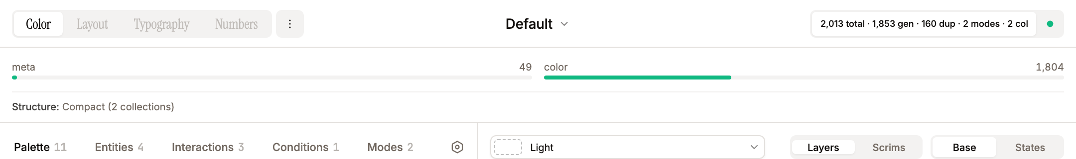
The global header (top toolbar) shows a single pill (data-testid="variable-count-pill"): {total} total · {generated} gen · {N} dup · {N} aliased · {modes} modes · {col} col next to the colored status dot. Both share the same segmented-control container as the section nav on the left and the preview filter toggles (bg-muted outer, bg-background + shadow-sm active item).
The · {N} dup segment (skipped duplicate tokens) and the · {N} aliased segment (tokens emitted as variable aliases) are each conditionally rendered — when the count is zero the segment (including its leading bullet) is omitted, so the line stays clean for fresh themes. total = generated + skipped duplicates.
When there are no tokens at all, the pill is disabled (greyed out, tooltip "No tokens generated yet").
When you hover a theme in the theme select, this pill recomputes locally for the hovered theme without writing to the store. Pulse animation is bound to actual stored values so hover preview doesn't trigger flicker.
Status Indicators
The status dot sits to the right of the count pill (a small filled circle in a button, with the warning count beside it when there are warnings). Its colour is computed in StatusPill.tsx:
- Green — valid and ready to push (
> 0tokens, no over-limit collection, no warnings) - Amber — warnings present (e.g. duplicate names, empty conditions/entities), but nothing blocking
- Red — a blocking condition: no tokens (
0total), a collection over the 5,000-variable limit, or more than 20,000 total variables. The tooltip shows "No tokens" / "Over limit" / "Too many vars" respectively
The status-dot button toggles the Warnings panel below the header — a coloured list of the current state (over-limit / over-20K message in red, the warning list in amber, "All good — ready to push" in green). Clicking the count pill itself opens the Collection Grid panel with per-collection variable counts and limit progress bars (each bar turns amber at ≥60% and red at ≥90% of the 5,000 limit). Both panels share a single slot below the header and toggle each other; opening one closes the other.
Warning Types
validateTheme() (in src/lib/token-engine.ts) produces the warning list. Common entries:
- No Level entity — using an implicit single level at the seed color (1:1)
- No modes — falling back to a "Value" placeholder at the theme seed color
- Empty theme name — push is blocked until a name is set
- Invalid / empty color, mode, interaction, or condition name — that item will be skipped
- Duplicate sanitized names — only the first is used
- Event in two states — only the first state's binding is used
- Entity with no parent entities / a missing parent / a non-Level parent — no tokens generated
- Entity referencing a missing interaction, condition, or color
- Entity with no colors / no contrast ratios — no tokens generated
- Level entity missing
levelConfigor with a pattern that has no usable step/values
Beyond the validateTheme list, two collection-count conditions turn the status dot red and block (or warn about) push: a collection over the 5,000-variable limit (blocks Push Vars) and more than 20,000 total variables. The amber validateTheme warnings are non-blocking; only the empty-theme-name and over-5,000-limit conditions actually prevent Push Vars.
Structure recommendation
The Collection Grid panel footer shows the current structure (Compact / Balanced / Granular + collection count) and, when the layout could be improved, a soft recommendation with a one-click Switch to {mode} button. computeStructureRecommendation() in StatusPill.tsx can suggest:
- Granular — when the largest collection exceeds (or is past ~80% of) the 5,000 limit, e.g. "Largest collection is at 84% capacity. Consider switching to Granular before it hits the limit."
- Compact — when on Balanced and everything would fit in one collection, e.g. "All N variables fit in one collection — Compact would simplify your setup."
- Balanced / Compact — when on Granular with lots of small collections that could consolidate
Recommendations are soft signals only: the status dot stays green for the Compact/Balanced suggestions, since they aren't real warnings. Only the over-5,000-limit case (which also shows a Switch button inside the Warnings panel) and other true validation/count failures escalate the dot's colour.